Solera Health·2024
A New Era of Healthcare Management
As Solera grew from a diabetes prevention program into a leader at the intersection of healthcare and technology, their brand needed to evolve as well. Solera partnered with Attic Salt to realign their identity to reflect both their current impact and future ambitions. Our goal: make Solera's unique value unmistakably clear to employers, brokers, and buyers. We crafted an identity that captured Solera’s core strength—simplicity—and communicated it in a way that made healthcare management feel accessible, efficient, and even a bit provocative. The rebrand defines Solera’s role in digital healthcare delivery and positions them as a progressive solution, setting them apart from traditional healthcare management. It embodies their ability to adapt and meet the needs of health plans and employers, positioning Solera for success in a new era.
Challenge
Health is a continuous journey, but it doesn’t have to be (and shouldn't be) complicated. To shape our creative direction, we looked at the end user's experience—how the average American employee navigates the maze of healthcare options in their quest for better health. The key to Solera’s approach is simplicity, so we anchored the brand around the idea that "it only takes one platform" to access a comprehensive digital health ecosystem with high-quality solutions and lower costs. We positioned Solera as the trusted guide on this journey, combining bold innovation with the reliability users need. This insight shaped a creative look and feel that confidently maintains that balance of pioneering and dependable.
Solution
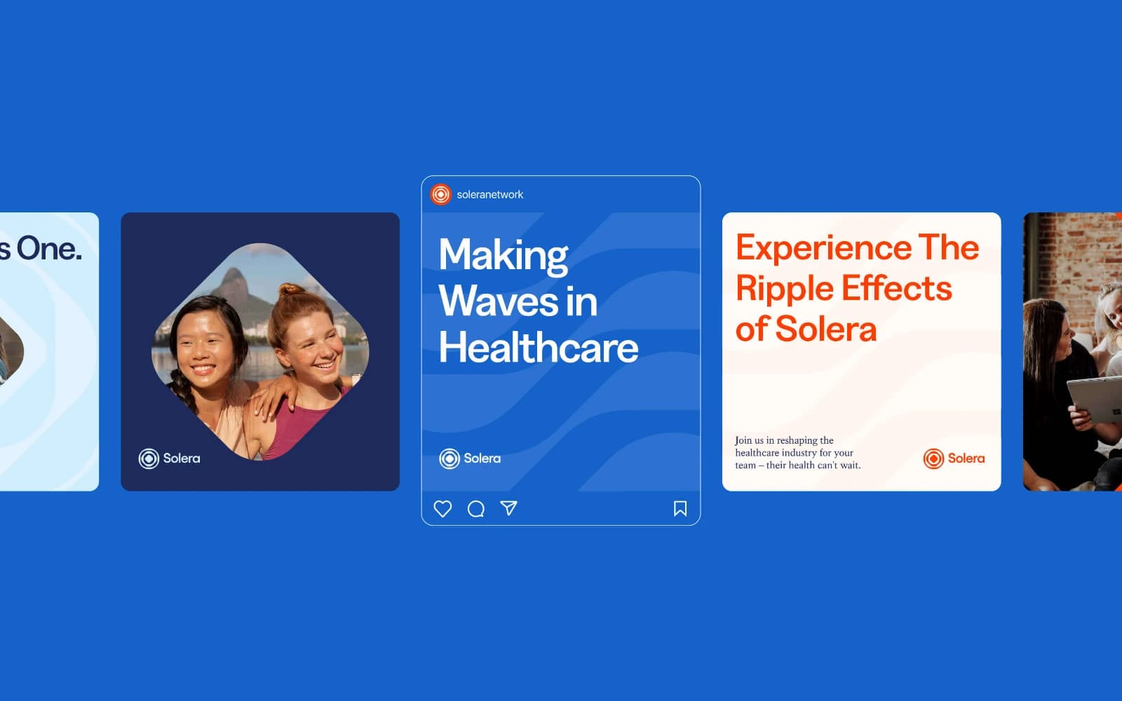
A droplet in a vast body of water creates a ripple effect that can be seen, felt and measured for miles. This mirrors Solera’s role in the healthcare ecosystem: a single, focused force creating lasting, measurable change. The Solera Ripple symbolizes the brand’s ability to adapt, connect, and expand within the ever-changing healthcare landscape. When we met Solera was in the midst of a major growth cycle driven by their sales and marketing teams. They needed a design system that could help streamline the creation and production of marketing assets. We crafted a complete design system using the brand mark. This lead to the droplet, ripples, and wave graphic devices which paired really nicely with their provocative language. We anchored this to the Greed typeface and Kings Caslon font to evoke that trust and dependability that Solera has become known for. For an added touch of personality and originality, we developed a complete icon set, infographics, and UI elements which we brought to life through interactive motion. All of these elements were then used to design the new web experience, and laid the foundation for a revamped platform design.
Results
With a new look comes a new voice. In an industry full of trite, red-tape-heavy language, we wanted Solera's brand voice to feel motivating and clear. We crafted strong, purposeful messaging that not only describes what Solera does but highlights what they enable others to achieve. The result is a verbal identity that's a breath of fresh air. Solera now speaks in bold truths and thought-provoking copy, yet is always consistent in delivery and rooted in truth.
Project Details
Year
2024