Yoga Arts
A Brand Built on Recovery, Focus & Growth
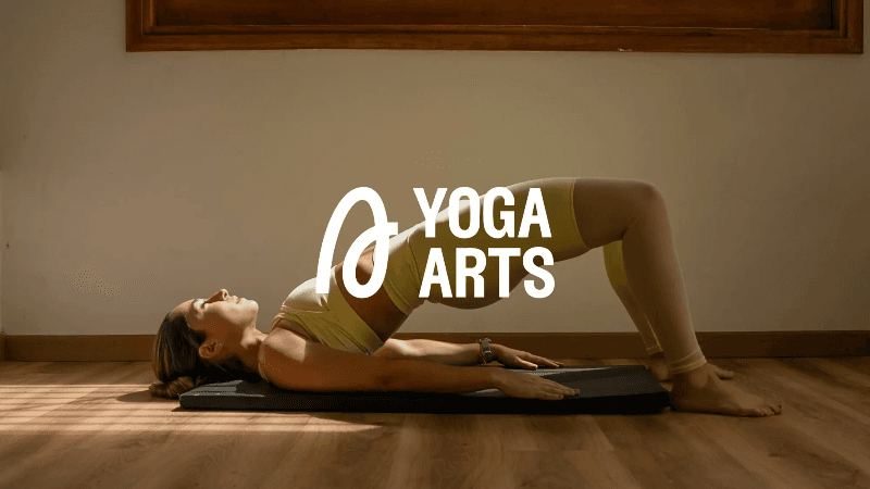
Designed a calming and empowering visual identity for Yoga Arts, a yoga space centered on recovery, focus, and growth. The brand targets people looking for more than flexibility — those after clarity, physical recovery, and performance through yoga. While primarily aimed at women, the visual language was designed to feel inclusive and welcoming to all. The palette combines earthy neutrals and oceanic blues to create a soft yet strong aesthetic — grounded, modern, and approachable. Typography uses clean, rounded sans serif fonts that echo breath, rhythm, and ease of movement. Imagery features real people in movement, highlighting strength, flexibility, mindfulness, and community. The tone throughout is clear, elevated, and restorative.
Challenge
The client needed a strategic partner to address key business objectives and deliver measurable outcomes in their market.
Solution
Our team developed and executed a comprehensive strategy tailored to the client's specific needs, leveraging industry expertise and proven methodologies to deliver results.
Results
Delivered a complete brand identity system including color palette, typography, imagery direction, and promotional materials. Created a visual language that feels grounded and inclusive — balancing calm with strength.