Camp Starfish·2023
Transforming a Nonprofit Brand Serving Children with Special Needs
The journey with Camp Starfish began at the end of 2022 when they approached us with a simple request—to collaborate on the creation of a new website. Little did we know the exciting transformation that was to come. What started as a refresh evolved organically into a comprehensive rebranding initiative, as we dove into the essence of Camp Starfish’s vision and purpose.
Challenge
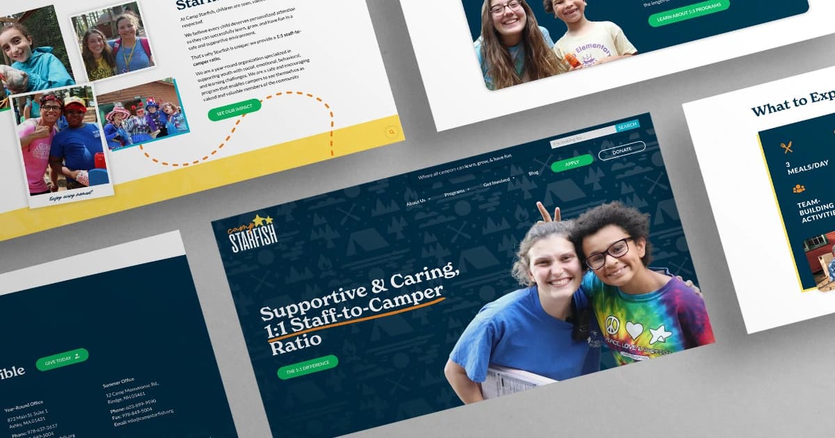
When Camp Starfish approached us, they faced several challenges with their existing brand. Firstly, their logo had not been revised for over a decade and appeared differently across various platforms and materials. Secondly, there were no clear guidelines on how to utilize the logo, resulting in inconsistent brand implementation across their website, social media platforms, and promotional materials. Moreover, the previous logo did not accurately convey Camp Starfish’s unique selling proposition of a 1:1 staff-to-child ratio, which they were proud to offer their campers.
Solution
When we presented an opportunity to more accurately and visually represent their brand, they were open to a complete logo remake that would better align with their mission and value proposition. When revamping their logo, we encouraged them to go for a completely new one that tells their story better. We used two stars to highlight Camp Starfish’s 1:1 staff-to-camper ratio. The refreshed typography and color palette not only brought a modern touch to their brand but also remained faithful to their mission. The incorporation of a cursive, hand-written font was used to resonate with the spirit of a children’s camp. It serves as a nod to the art of scrapbooking, capturing the essence of children joyfully preserving unforgettable moments. Additionally, the carefully chosen colors, derived from their previous brand, were separated to elicit emotions of hope and joy. This design approach set the brand apart, infusing it with a positive and uplifting atmosphere that aligns with the camp’s ethos.
Results
The brand refresh and website redesign for Camp Starfish were enthusiastically received by the client and surpassed their initial objectives. The new logo, incorporating the Starfish story and showcasing the 1:1 staff-to-child ratio, resonated strongly with the camp’s target audience of parents with children with special needs. The brand guide and stylescape provided clear and concise guidelines for consistent branding, enabling Camp Starfish’s internal team to maintain a cohesive and professional brand image across various platforms. The brand materials were then utilized to create a website with high-design aesthetics and a user-friendly interface that appealed to both adults and children, leaving a positive impression of Camp Starfish as a safe and enjoyable place for children with special needs.
Technologies & Tools
WordPress
The team is small enough to provide individualized attention but possesses the knowledge and experience of a large firm. We felt listened to and respected as individuals during the six months we collaborated on the project. Though Embark is not from the same industry as our company, they conducted extensive market research to ensure the project exceeded industry standards. We would hire Embark again, many times over!
Jamie Mahnken, Executive Director