Designing Both Sides of an AI-Enabled Fertility Clinic
Ovom Care is reinventing fertility care from the ground up: a digital-first, AI-enabled fertility clinic founded in Berlin by Felicia von Reden alongside clinician Dr Lynae Brayboy, with physical clinics in London and Portugal and an expansion across Europe underway. The company has been recognised in Forbes 30 Under 30 Europe 2025 (Science & Healthcare) and WIRED's Hottest Startups in Berlin.
We designed both sides of their product from one body of clinical truth: a patient app warm enough to hold someone through the hardest weeks of their life, and a clinician platform sharp enough to make a vast, complex treatment readable at a glance, plus the AI features, App Store presence, and marketing assets around them.
Challenge
IVF is deeply taxing for the people going through it. Weeks of daily hormones, constant blood monitoring, and medication self-injected on a strict schedule where being late isn't an option. For long stretches, patients simply feel awful, and at the end there's an outcome no one can promise.
The tools meant to help rarely did. Fertility apps tend to be either coldly clinical or a bare list of tasks, with none of the care patients need. Clinician software is worse: clunky, outdated, and overwhelming. Every doctor we interviewed was frustrated with the software they used, and openly sceptical that Ovom could deliver on the promise of something better.
Ovom wanted something distinctly different on both sides of the screen: comprehensive but not overwhelming, warm without being shallow. Which left one difficult design problem at the centre of the brief: how do you take one dense body of clinical information (IVF protocols, blood panels, test types, scans, medications, appointment types, and the edge cases that make fertility care especially tricky) and shape it into a product on two very different levels, for the patient and for the clinician?
Solution
We started by fully immersing ourselves in the intricate world of IVF: blood panels, test types, protocols, what can go wrong and when. You can't simplify something you don't understand. From there, every design was tested weekly with real patients and real clinicians before it went forward, so the product was shaped by the people who'd live in it rather than by our assumptions.
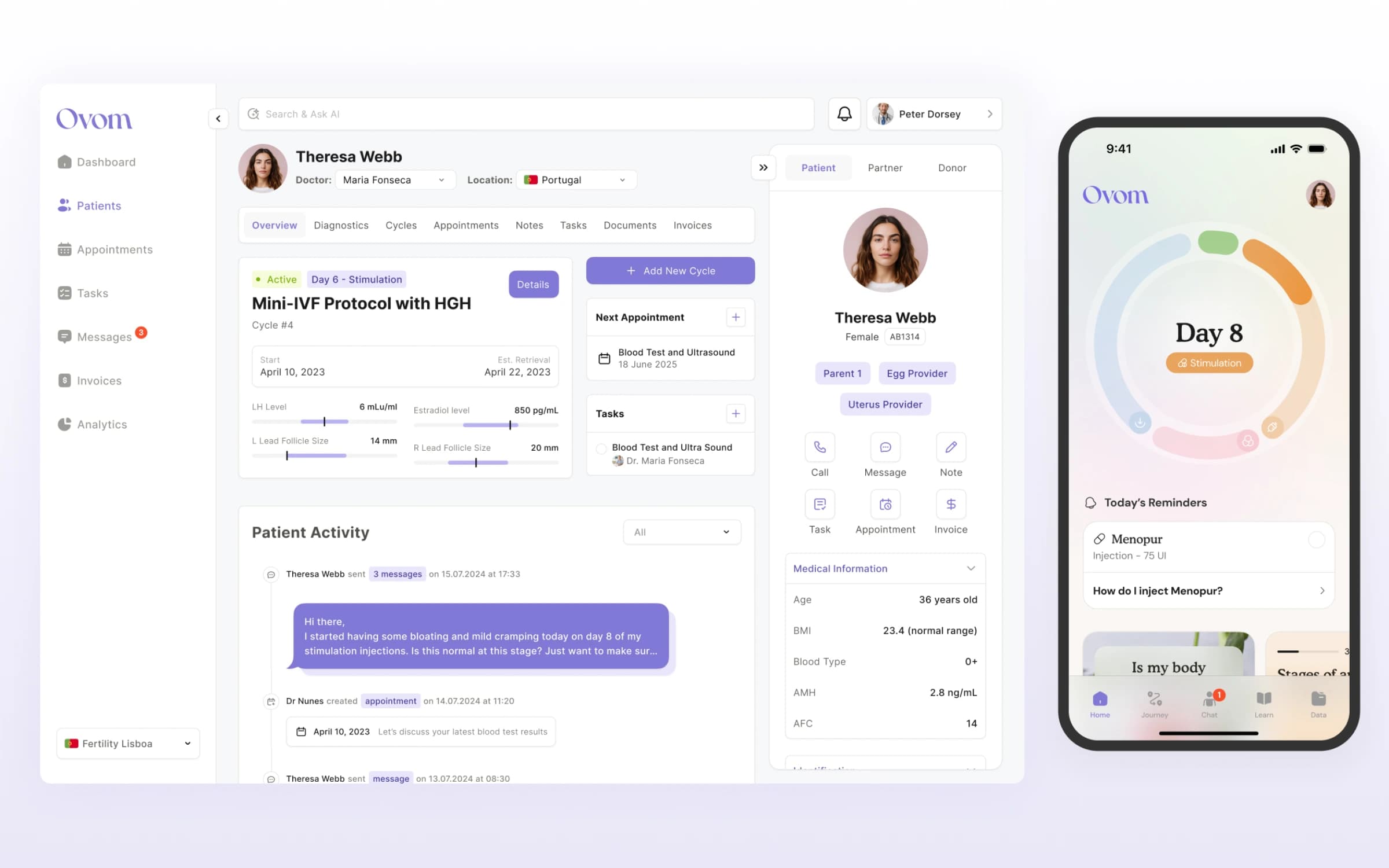
A patient app that holds people through the hardest weeks. The home screen answers the question every patient carries: where am I? A phase-aware timeline shows where you are in your protocol and what's coming next, so the weeks ahead feel finite rather than endless. Reminders keep the non-negotiables front and centre. Symptom logging goes straight to your doctor's platform, so you don't need to wait in a phone queue to be heard. A contextual knowledge hub surfaces guidance tied to your exact stage and specific medication, written and reviewed by Ovom's own clinicians, and in-app chat keeps the care team one tap away.
Clinical complexity turned into clarity for clinicians. At the start, every field and panel was equally urgent. Our work, alongside the medical team, was deciding what each doctor actually needs to see, and when. To win over sceptical doctors, we designed hand in hand with them: some screens were pure UX, others a deep reorganisation of dense pre-existing views, taking a wall of graphs and data and making it digestible at a glance.
AI that works where the clinician naturally goes. Rather than a feature parked in a corner, we designed AI into the background of the platform: it surfaces flags from the clinical picture, like an abnormal blood result or a trend suggesting a medication isn't doing its job, and raises them to the doctor proactively. In search, pulling up a patient brings in-context prompts: a summary of the current cycle, a check for missed medication, a suggested next step.
The brand around the product. App Store screenshots and marketing assets that carry the product's warmth into how Ovom presents itself publicly.
Results
- Both sides of the screen, designed from one clinical truth: a patient app and a clinician platform for one of healthcare's most complex and sensitive spaces
- A patient experience people describe as making them feel genuinely cared for: patients report feeling held, informed, and understanding where they are in treatment
- A clinician platform unlike legacy medical software: the medical team described it as faster to read, more relevant, and easier to use than the tools they were used to, won over from initial scepticism through weekly co-design
- Dense, multi-source clinical data made glanceable: protocols, blood panels, scans, and medications reorganised around what each doctor needs, when
- Compounding credibility: Ovom has been recognised in Forbes 30 Under 30 Europe 2025 and WIRED's Hottest Startups in Berlin, and has continued to raise investment and expand its clinics across Europe
Winning Over Sceptical Clinicians
Every doctor we interviewed was frustrated with the software they used, and doubted better was possible. So instead of presenting finished designs, we made clinicians co-authors. Weekly sessions where they scrutinised prototypes in depth, decisions about data hierarchy made with the medical team rather than for them, and scope that grew, shrank, or changed shape based on living feedback rather than a fixed spec. The result was a platform the team described as faster to read and easier to use than their previous tools, and a lesson we'd give any healthtech founder: in clinical products, adoption is designed in the room with the people who'll use it, not shipped to them afterwards.