World-Class Fintech Design at Startup Speed for Stackwell
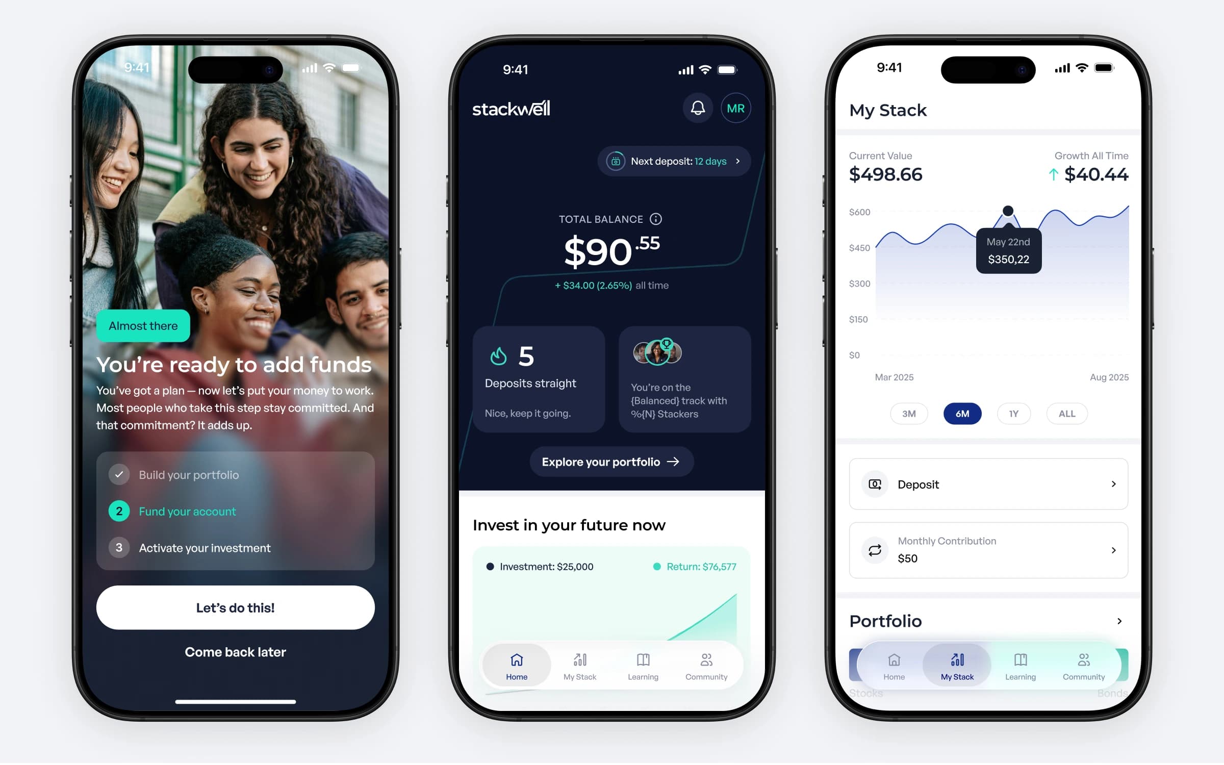
Stackwell is an investing app on a mission to eliminate the racial wealth gap, backed by Fenway Sports Group, The Kraft Group, and Social Change Fund United, with NBA and WNBA partnerships driving financial wellness across four major US cities.
For over 18 months we've been working with Stackwell's product team as their design partner: building a comprehensive design system, systematically redesigning the entire mobile app from MVP aesthetic to a polished fintech experience, grounding UX decisions in real user data, and producing the investor decks and marketing assets that carry the brand's ambition. All on a flexible capacity model that scales up or down with the reality of startup life.
Challenge
Stackwell isn't building just another investing app. Their product exists to make wealth-building accessible, educational, and achievable for underserved communities, which raises the stakes on every design decision. The audience includes people who have been failed by financial institutions before, so every screen had to build trust and every interaction had to make investing feel achievable rather than intimidating.
The team had proven the concept, invested nearly $800K back into the Black community through seeded accounts, scholarships, and grants, and was ready to level up from MVP to a product that competes with top-tier fintechs. But they couldn't yet justify hiring a full-time design team capable of delivering on that vision. They needed world-class design thinking without the overhead: a partner who could move at startup speed, understand fintech complexity, and amplify the product rather than just maintain it.
Solution
We embedded directly into Stackwell's development rhythm: working in their tools, syncing weekly on priorities, and flexing monthly capacity to match actual needs. When priorities shifted mid-sprint, the work shifted with them. When team members changed, we maintained continuity. The work ran in five strands:
A foundation built for scale. We created and maintain a comprehensive design system that accelerates development, keeps the experience cohesive, and lets Stackwell's dev team ship features with confidence. We also rolled out accessibility compliance across the product, critical for a platform serving diverse communities.
Systematic mobile redesign. Rather than pausing the product for a big-bang overhaul, we led a sprint-by-sprint redesign of the entire app, reimagining information architecture, interaction patterns, and visual language while the roadmap kept moving. The app went from MVP aesthetic to the polished, intuitive experience users expect from financial products they trust.
UX grounded in data, not assumptions. Every flow was reviewed through the lens of real user behaviour. We analysed the metrics and customer feedback Stackwell collected, identified friction points, and redesigned the flows that moved business KPIs, treating design improvements as growth levers rather than aesthetic upgrades.
Features that become calling cards. We transformed Stackwell's Playlists educational feature from generic learning modules into a visually striking experience, proof that the product's design execution matches its mission, and compelling enough to anchor investor conversations.
Design support beyond the product. Investor presentations that communicate Stackwell's vision with clarity, marketing collateral that speaks to their audience with authenticity, and partnership assets that position Stackwell as a serious player in fintech.
Results
- A design partnership that lasted: 18+ months embedded in the product team, through feature launches, team changes, and product pivots, scaling capacity up and down as the startup needed
- A product that scales without breaking: the design system lets Stackwell's developers ship faster while keeping the cohesive, accessible experience financial products demand
- An app that competes at the top tier: systematic redesign moved Stackwell from MVP aesthetic to a modern, polished fintech experience
- Reduced friction at critical moments: data-driven UX decisions improved activation and retention at key points in the user journey
- Design that wins over investors: in the client's words, "As we've shown different people, even investors, they've just loved seeing the look and feel of it"
Designing Trust for First-Time Investors
Stackwell's users include people who have been failed by financial institutions before, so trust wasn't a brand value, it was the core design requirement. We built it into the details: an onboarding checklist that celebrates each step ("You're ready to add funds"), portfolio choices explained in plain language across Balanced, Moderate, and Aggressive tracks, streak mechanics that reward consistency over portfolio size, and educational Playlists that meet people where they are, like the "What's Your Money Blindspot?" quiz. Every pattern was chosen to make investing feel achievable rather than intimidating, and validated against Stackwell's own activation and retention data.
Technologies & Tools
Lumi has flexed with us and with our needs over time and has the skillset to be able to adapt to different styles and requests very quickly. In a startup environment, that's extremely valuable.
Larysa King, VP Product, Stackwell Capital
Project Details
2026
18+ months, ongoing
$50K – $100K
10 people