A.MANO Brooklyn: Brand Identity for a New Home Decor Shop
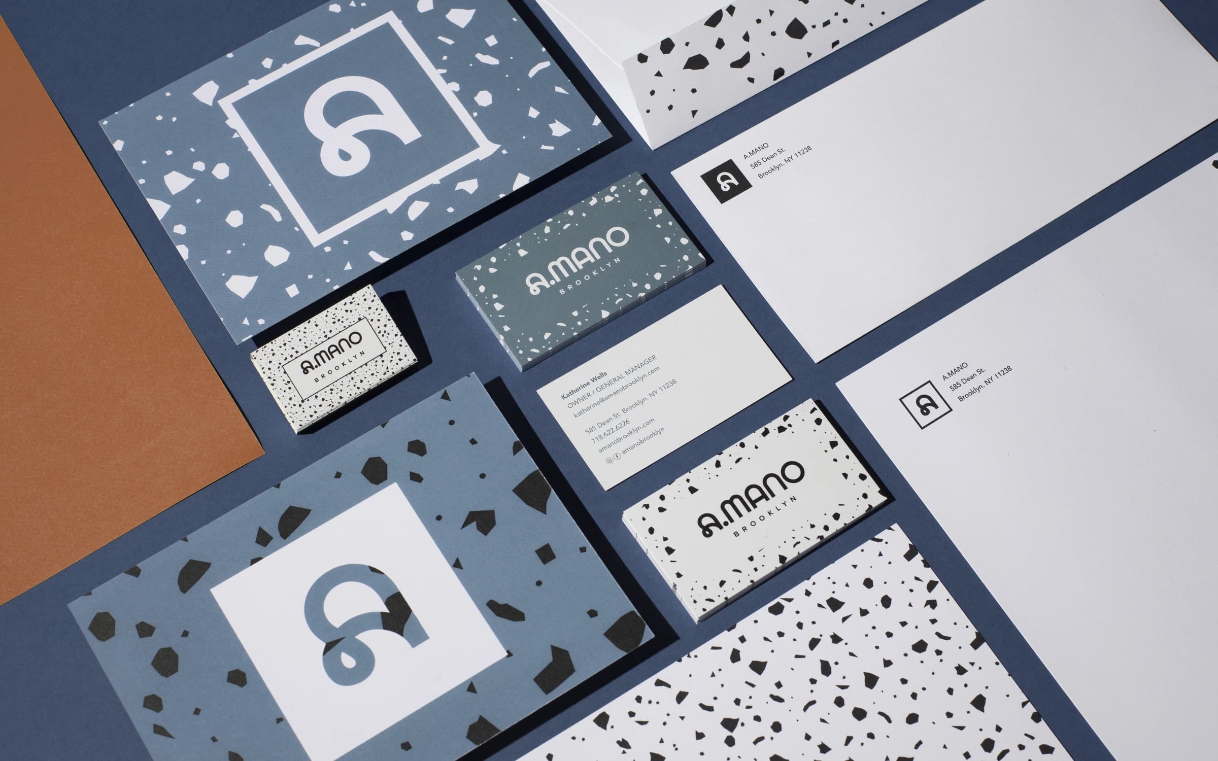
A.MANO Brooklyn is a home decor shop merging locally-made ceramics, vintage art, and up-cycled fine furniture, owned by Katherine Wells. Sergio Mannino Studio developed the full brand identity for the new business, logo, typeface system, color palette, and applications, alongside the store interior it would live in.
Challenge
The business had no existing identity to build from, a name that needed a visual system built entirely from scratch. The brand had to communicate two things at once: the handmade, one-of-a-kind nature of the ceramics being sold (A.MANO translates to "handmade") and a design sensibility fusing Donald Judd's minimalism with the Memphis group's postmodern language, reflecting the studio's own dual heritage of Italian Radical Design and American minimalism.
Solution
Sergio Mannino Studio built the identity around a modular "A" logo mark, set in the Lyno typeface by Radim Peško, designed to work independently, with or without the Brooklyn tag, framed or on a solid background. The primary palette, black, white, and smoky blue, was drawn directly from the materials used in the interior, the floor and glazed brick, so the brand and the space read as one system rather than two separate decisions. A secondary palette in warmer, lighter tones, including a soft green, extended the identity into applications like signage, business cards, and letterhead.
Results
The project has won the 2023 ICFF Interior Awards and has been published by Frame Magazine, Platform, Logos World, among others. The brand system has scaled with the business: what began as a retail and gallery space has since expanded to a full-size café, carrying the same identity forward.
Project Details
2019
12
$500K – $1m
5 people