Krema Yogourt Packaging Redesign
The indulgent yogourt category is growing as consumers seek healthier snacks and desserts that feed the body and the senses. As part of the Olympic brand, consumers recognize Krema as a high-quality 100% natural product with a rich, thick texture. However, as a decadent line, the Krema package design needed to amplify the sensorial experience, speaking to irresistible flavors as well as the texture. The category has a few dominant competitors that the design would need to disrupt at shelf by creating a fresh take on premium indulgent yogourts.
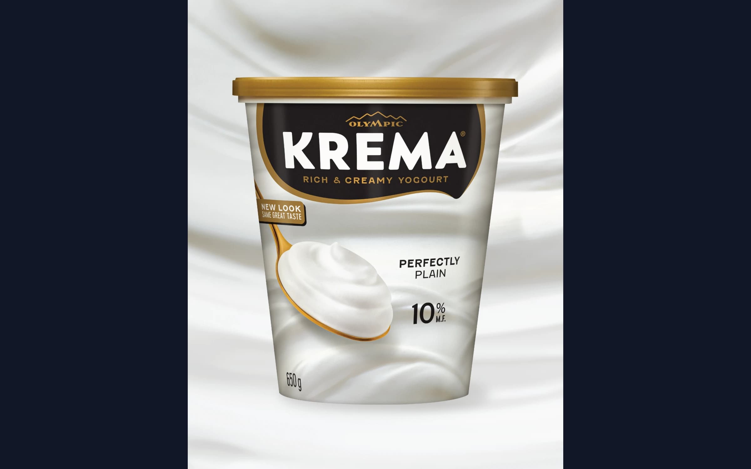
Anchored in indulgence, the new design distinctly portrays the decadent, creamy texture through a dollop shape that frames the wordmark, and with rich, thick swirls as a textural backdrop. Touches of gold, romance copy, and sophisticated flavor images are simple but strong premium touches. The Krema name is given more prominence with a font that’s similar to the original to ensure recognition, but slightly bolder and more unique. The Olympic logo was minimized to allow Krema to shine, while still maintaining the brand equity.
Challenge
Krema needed to amplify the sensorial experience. The challenge was to create a packaging design that could stand out against the competitors on the shelf set. Additionally, the packaging needed to give off a sense of being indulgent and premium, while communicating the individual flavors.
Solution
The strategy for the design was to dial up a sense of indulgence and introduce Krema as a stand-alone brand in the Olympic family. Touches of gold, romance copy, and sophisticated flavor images are simple but strong premium touches. The Krema name is given more prominence with a font that’s similar to the original to ensure recognition, but slightly bolder and more unique. The Olympic logo was minimized to allow Krema to shine, while still maintaining the brand equity.
The solution was to design packaging that accents the sense of premium and indulgence with Imagery that entices appetite appeal and purchase. The new design distinctly portrays the decadent, creamy texture through a dollop shape that frames the wordmark, and with rich, thick swirls as a textural backdrop.
Results
The updated design puts creaminess and flavor in the spotlight, communicating that Krema is not your everyday breakfast yogourt. New packaging for this delicious, rich treat hit the shelves of Canadian grocery stores in August 2024.
Our analysis shows the new design improved market performance, leading to a +4% uplift in brand velocity within the first month2.” “Since Krema launched in August, Several new shoppers to the brand mentioned buying KREMA driven primarily by the packaging. Many of them highlighted that it is a visually distinctive package on shelf. The gold elements, along with the white wordmark on a black background and the perceived “simplicity” of the design aesthetic, led many to perceive it as a premium offering; equally, its communication is clear, and the appetizing (swirling) images of the yogurt product on the bottom and in the spoon elevate the appeal of the flavor
Andrea Molina Caprio , Brand Manager
Project Details
2024