Packaging Redesign for Clover Leaf Seafoods Premium Line
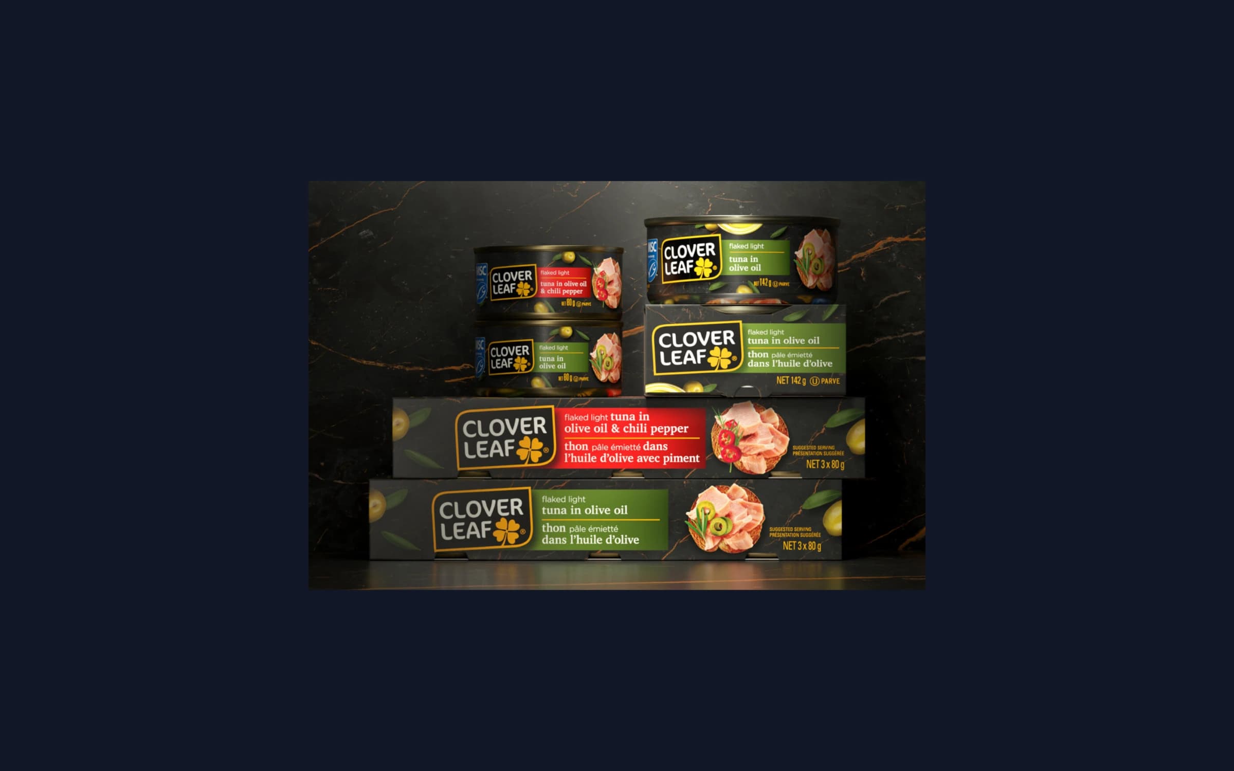
To captivate food enthusiasts, Clover Leaf Seafoods introduced a premium product line. The packaging design should look modern, appealing, and inspiring, all while setting the brand apart from competitors and other product lines under Clover Leaf Seafoods. The brand needed key visual elements that could be expanded upon, allowing for future launches. The overall goal was to establish the premium quality of the products with strong culinary cues.
For better differentiation within the brand’s portfolio, a black background was chosen to elevate the products. A thoughtful mixture of two fonts, both serif and sans-serif, was adopted in the product descriptor for visual interest and hierarchy of information. To emphasize the message of “tuna in olive oil (& chili pepper)”, a bolder, more refined font was used. In terms of food photography, the focus centers on core ingredients in a simple and uncluttered manner to drive appetite appeal. Olives were specifically highlighted to emphasize “made with olive oil”, further amplifying the high quality.
Challenge
The challenge was taking the Clover Leaf established look and giving it a premium feel, and it conveyed this with the application of graphics. The packaging design needed to look modern, appealing, and inspiring, all while setting the brand apart from competitors and other product lines under Clover Leaf Seafoods. Additionally, the brand needed key visual elements that could be expanded upon, allowing for future launches. The overall goal was to establish the premium quality of the products with strong culinary cues.
Solution
The project presented a unique opportunity to showcase tuna in an elevated way and attract the attention of the “foodies” with eye-catching images of real food. Presenting these images in a way that would speak to the product's premium feeling and, at the same time, give consumers ideas of how the product can be used, pushing it beyond the usual tuna application. In this case, tuna is presented as a charcuterie-style appetizer.
For better differentiation within the brand’s portfolio, a black background was chosen to elevate the products. A thoughtful mixture of two fonts, both serif and sans-serif, was adopted in the product descriptor for visual interest and hierarchy of information. To emphasize the message of “tuna in olive oil (& chili pepper)”, a bolder, more refined font was used. In terms of food photography, the focus centers on core ingredients in a simple and uncluttered manner to drive appetite appeal. Olives were specifically highlighted to emphasize “made with olive oil”, further amplifying the high quality.
Results
Since Clover Leaf Tuna launched in January 2024, it has quickly captured a 23% share of the ready-to-eat meal segment. At Walmart, the product’s introduction has been particularly successful.
“Since Clover Leaf Tuna Salads launched in January 2024, it has quickly captured a 23% share of the ready-to-eat meal segment. At Walmart, the product’s introduction has been particularly successful. With eye-catching packaging design and a promotional feature price of $2.97 (compared to the regular price of $3.97), along with a 300-half-pallet display, we sold 85% of the volume of our biggest competitor’s sales – a huge gain – all before we’ve even started any marketing activities.”
Li Cao , Director of Marketing Clover Leaf Seafoods Corp.
Project Details
2024