Quaker Oatmeal Squares Packaging Refresh
Quaker has long held a reputation as a trusted breakfast cereal. But in a shifting category where consumers are increasingly drawn to taste-forward options with wellness benefits, the brand faced an inflection point.
Challenge
Aging out of its core demographic, the brand was seen as reliable but uninspiring. SLD partnered with Quaker to redesign the packaging for its Oatmeal Squares. The challenge was to not only improve taste perception and maintain its nutrition-forward promise but also widen its appeal beyond older consumers in a craveable way.
Solution
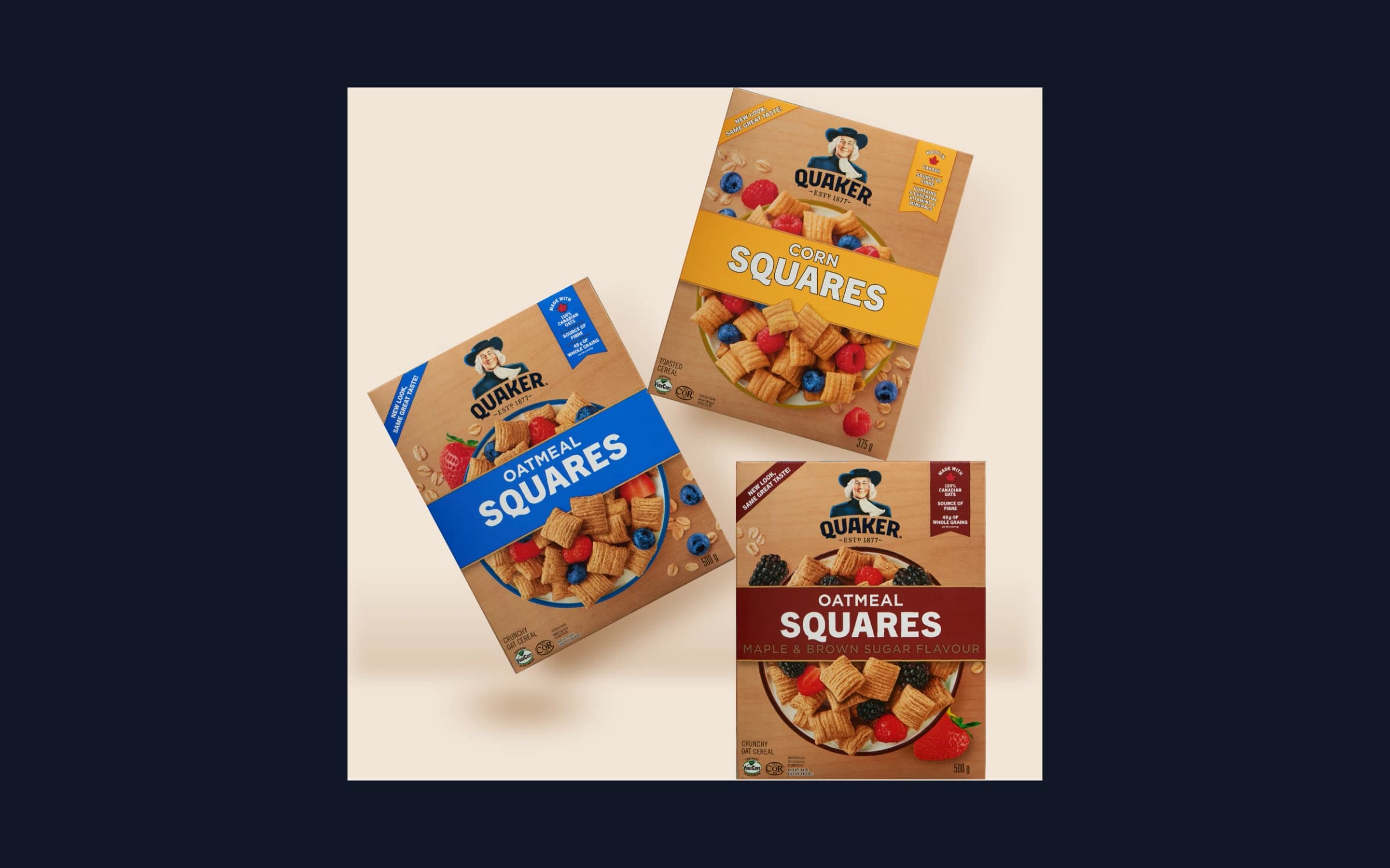
The new design introduces a delicious top-down view of a bowl brimming with the oatmeal squares and a medley of berries. The texture of the cereal is crisp and detailed, highlighted by a close-up of two squares, showcasing their hearty ridges and golden hue. The Quaker logo holds its familiar place to reinforce trust and history, while the updated layout brings a modern, youthful energy to the pack. Bolder, rounder fonts improve legibility and approachability. A top-right badge highlights key claims like “Source of Fibre” and “48g of Whole Grains,” with a refined hierarchy that balances health and appetite appeal. Distinct color bands for each flavor strengthen billboarding and make shelf navigation effortless. The new design demonstrates how heritage brands can evolve. By leaning into taste and simplicity, Quaker repositioned its cereal line to grow with a new generation, winning both hearts and morning routines.
Results
The design enhances shelf presence through clear flavor differentiation, strong visual hierarchy, and approachable typography. Product imagery emphasizes texture and sensory appeal, helping it catch the eye in a competitive retail environment. Color coding and structured layout make navigation effortless for shoppers, while consistent brand elements reinforce recognition and trust. The cohesive approach ensures the packaging communicates both heritage and modernity, making the product compelling on shelf and adaptable for digital presentation.
Project Details
2025