
Get ahead with an expert team
Discover & hire a top-rated agency to deliver results on your next task or project
Projects matching your needs
115 projects to explore

Branding
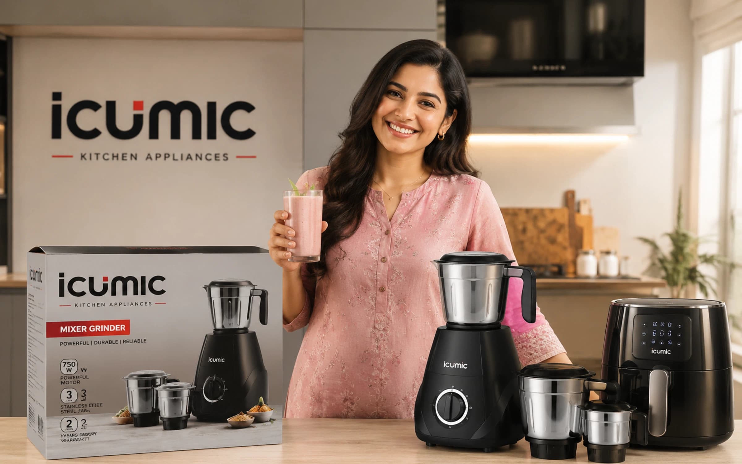
Icumic
Icumic is a [consumer electronics and appliance brand](https://www.trubranders.com/) developed to bring modern technology, functional design, and everyday convenience together. TruBranders worked on creating a distinctive brand identity that feels contemporary, reliable, and accessible, giving Icumic a strong foundation for the competitive consumer electronics market.
 TruBranders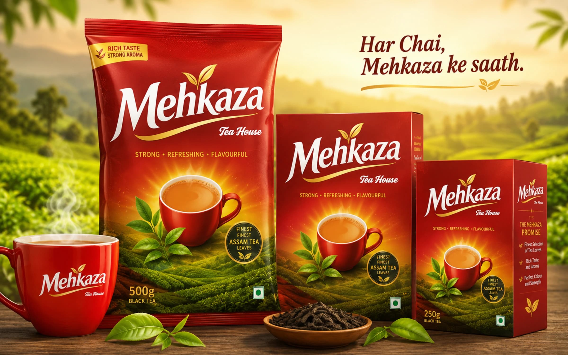
Branding
Mehkaza
**Mehkaza Tea House** is a complete tea branding project by TruBranders, covering [brand naming](https://www.trubranders.com/), strategy, visual identity, logo design, and packaging. The brand was created to reflect the rich taste, strong aroma, and authentic character of Assam tea through a bold red-and-gold identity, distinctive typography, and tea-inspired visual elements. The packaging combines premium appeal with approachable FMCG shelf presence, creating a cohesive and memorable tea brand from name to final product.
TruBranders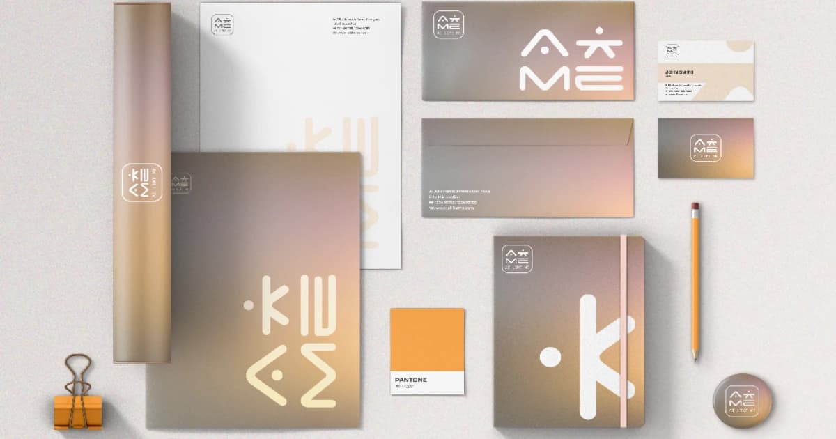
Branding
MERGING HUMANITY AND AI | The Thoughtful Design of AiLikeMe
Link to the full case study: https://mpmteam.net/projects/ailikeme-case-study AiLikeMe partnered with MPMTeam to create a brand identity and product experience that bridges artificial intelligence with human connection. The result was a cohesive, emotionally-driven brand system designed to build trust, improve user experience, and position the platform as a more human alternative in the AI space.
 MPMTeamVerified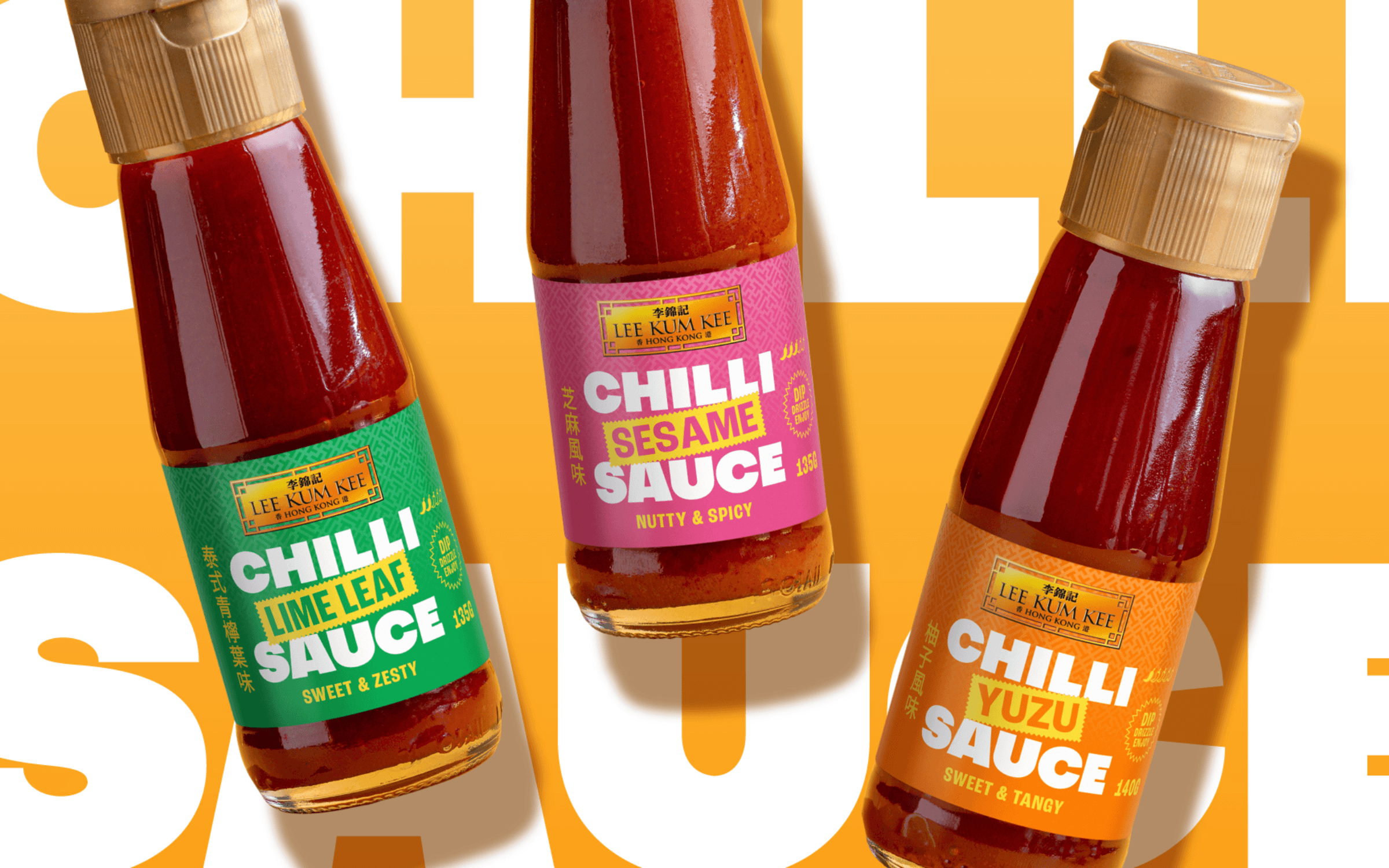
Packaging Design
TURNING UP THE HEAT FOR A NEW RANGE
Deuce Studio partnered with Lee Kum Kee to create the brand identity, packaging and campaign assets for the company's first-ever bottled chilli sauce range. The project introduced a bold new product line that appealed to younger consumers while remaining true to Lee Kum Kee's 135-year heritage and reputation for authentic Asian flavours.
 Deuce StudioVerified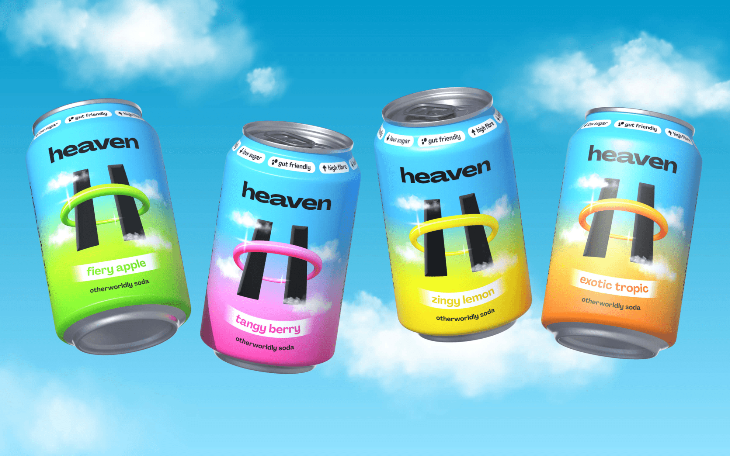
Branding
LIFTING GUT FRIENDLY SODA TO THE HEAVENS
Deuce Studio created the complete brand identity and packaging for Heaven, a gut-friendly soda brand, helping transform a functional health product into a vibrant lifestyle brand that appeals to modern consumers.
Deuce StudioVerified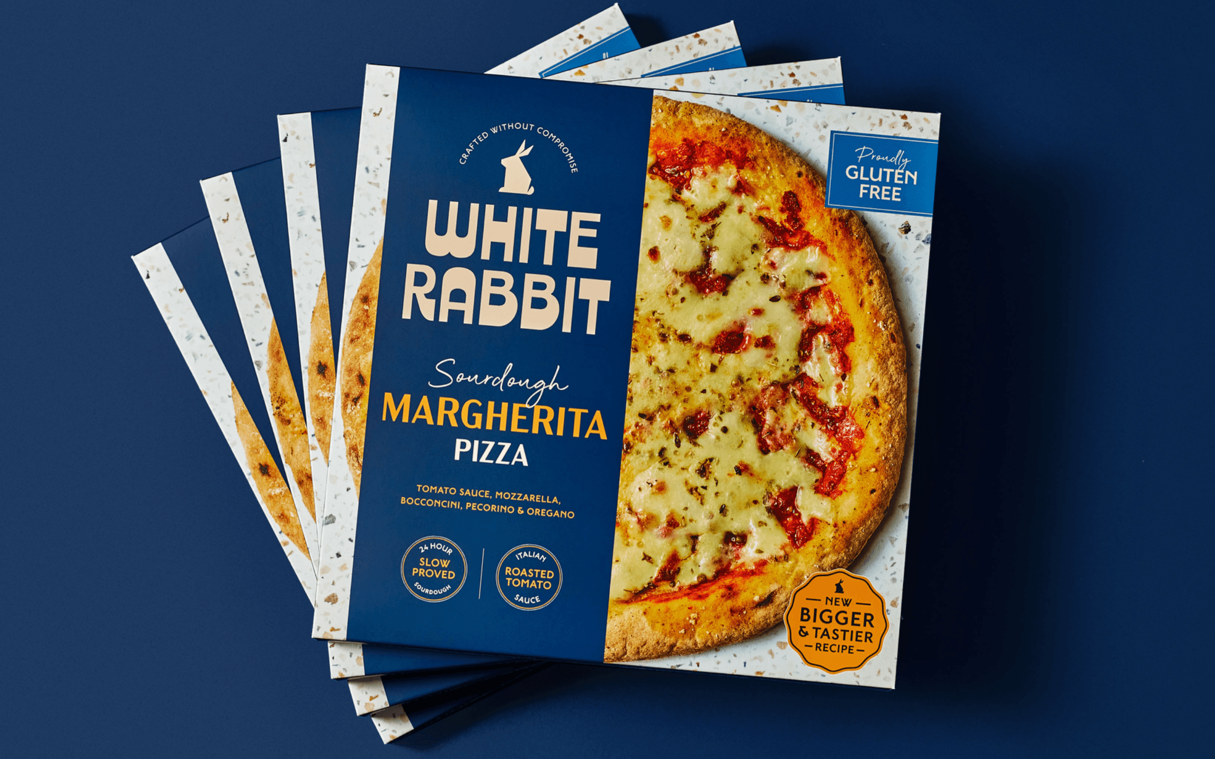
Branding
HELPING GLUTEN FREE PIZZA HOP TO THE TOP
White Rabbit partnered with Deuce Studio to refresh its brand identity and packaging, creating a premium, modern brand that reflected the quality of its products and its ambition to become the UK's leading gluten-free pizza brand.
Deuce StudioVerified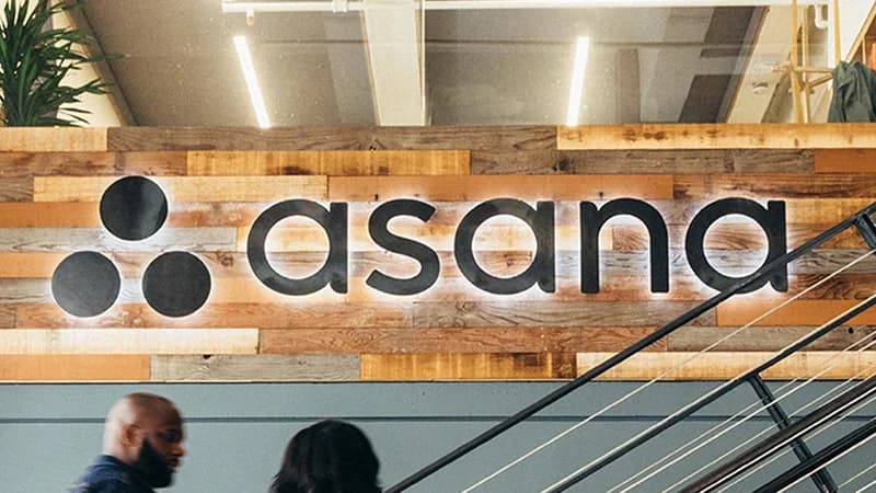
Branding
Asana: Branding a Leader in Project Management Software
At Catchword, we take immense pride in having partnered with Facebook co-founder Dustin Moskovitz and Justin Rosenstein to create a brand identity that transcends typical Silicon Valley tropes. Our goal was to develop a name that stood out from the "IT herd" by tapping into the 10,000-year-old Sanskrit concept of Asana—the yoga pose—to bridge the gap between mindfulness and the business world's need for focus, flow, and clarity. We strategically chose this name for its global accessibility, easy vowel-consonant-vowel pronunciation, and a visual symmetry that perfectly reflects the balance of the platform itself. Seeing the brand grow from a unique, category-defying startup to a public company serving millions of customers in 190 countries validates our commitment to creating names that are not only memorable but truly endure the test of time.
 CatchwordVerified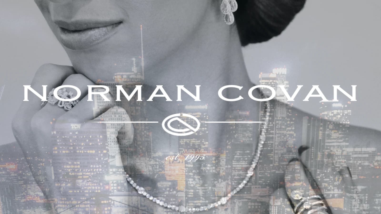
Branding
Norman Covan Jewelry Brand Refresh
Robyn & Robyn partnered with Norman Covan to refine the brand’s visual identity and presentation for a more elevated, premium-facing audience. The project focused on strengthening the brand’s look and feel, improving consistency across touchpoints, and creating a more polished visual system that better reflected the quality and sophistication of the jewelry brand.
 Robyn & Robyn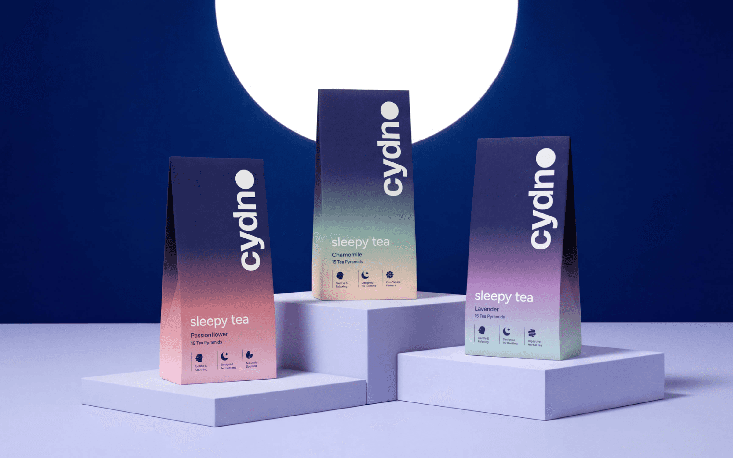
Branding
SENDING A SLEEPY TEA START-UP TO THE MOON
Deuce Studio partnered with Cydno to create a premium brand identity and packaging system for a modern tea brand, combining traditional craftsmanship with a contemporary aesthetic to help the brand stand out in the growing speciality tea market.
Deuce StudioVerified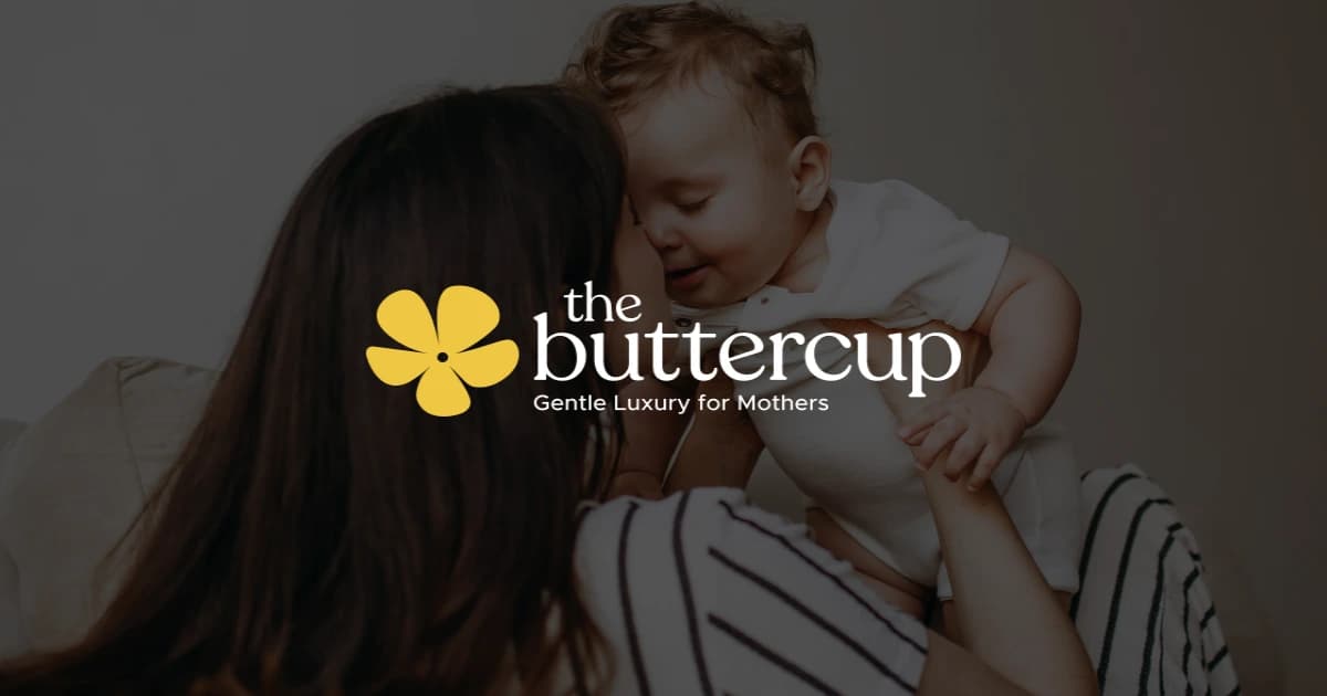
Branding
The ButterCup — Premium Maternal Care Brand Identity
The ButterCup is a premium maternal care brand built around comfort, trust, and emotional reassurance. We developed the complete brand identity, including strategy, messaging, visual identity, and packaging for its initial product range.
 Jordie's Creative AgencyVerified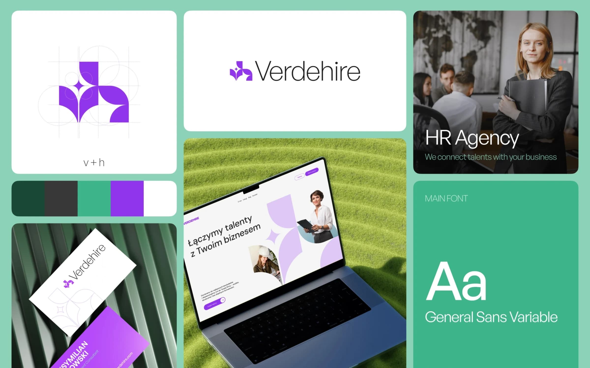
Branding
Verdehire – Branding & Website
Building a Complete Brand and Digital Presence for a Modern Recruitment Company For Verdehire, we created the entire brand identity and website from the ground up. The project focused on building a professional and recognizable brand that clearly communicates the company’s expertise in recruitment and talent acquisition.
 Karts Design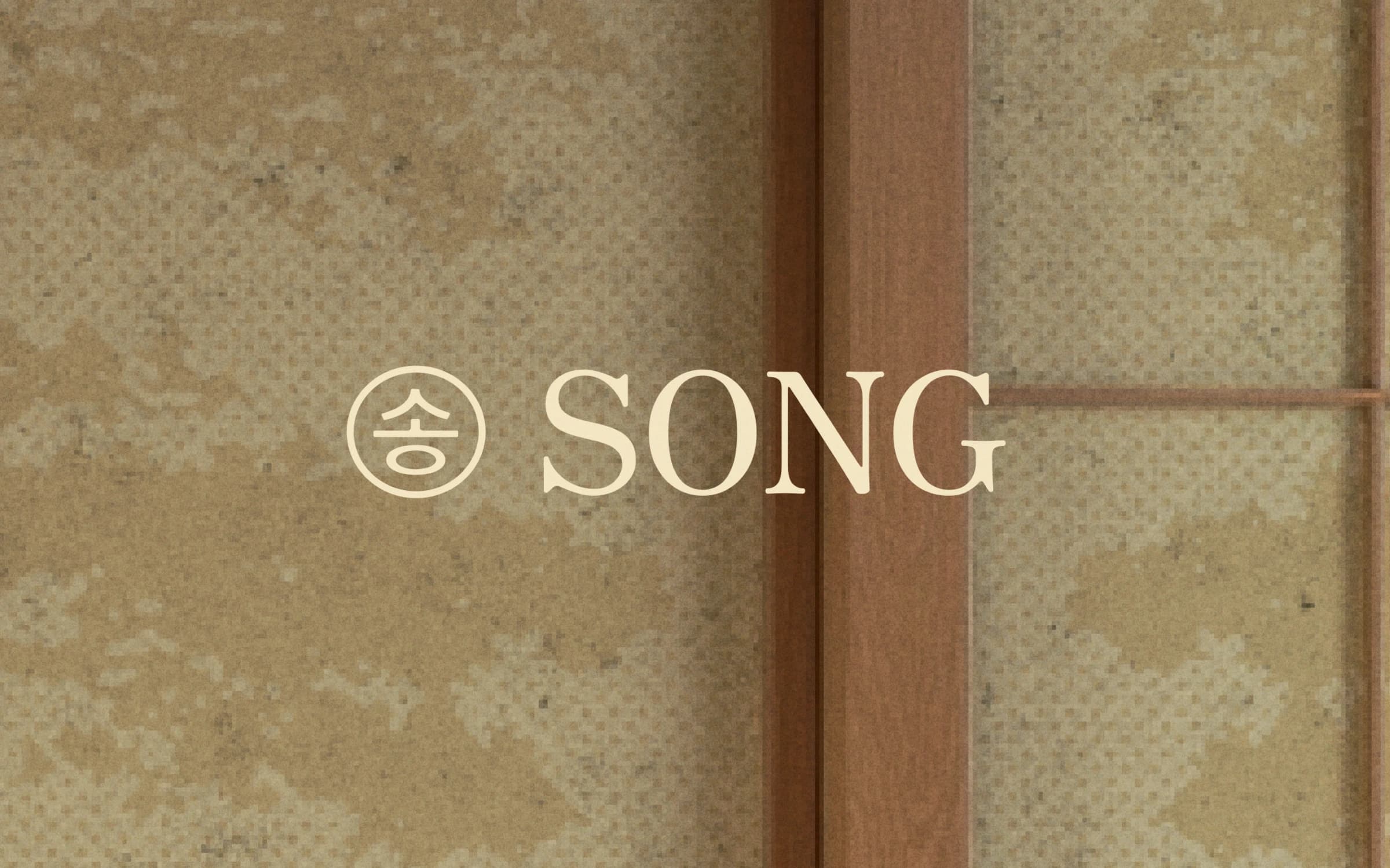
Creative Direction
Song | A Complete Hospitality Brand Experience
Song is a hospitality concept shaped around calm, ritual, and a deep connection to nature. Creative Wise developed the brand as a complete experience, creating an identity system designed to live far beyond the logo. Our work extended across creative direction, print, menus, signage, guest collateral, amenities, branded products, and digital applications. Inspired by the textures, colors, and quiet atmosphere of the natural landscape, the resulting system gives Song a distinctive visual language that remains consistent throughout every stage of the guest experience.
 CreativeWise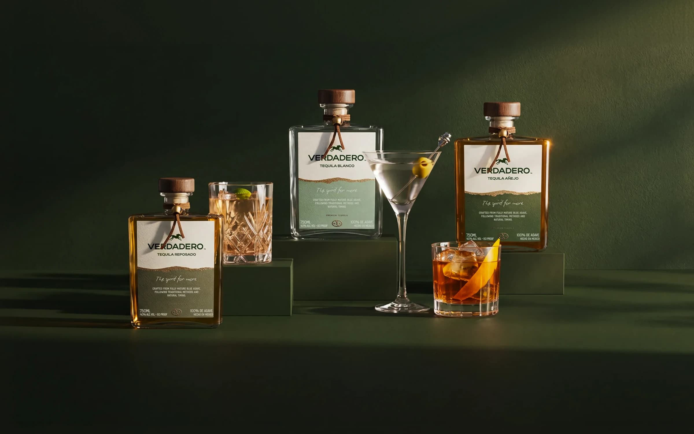
Creative Direction
Verdadero Tequila | Brand Rebrand, Packaging & E-commerce
150+ locations Retail & Hospitality Network
CreativeWise
Branding
Branding and visual identity for an innovative DeFi platform
40% Site Traffic
 Clay GlobalVerified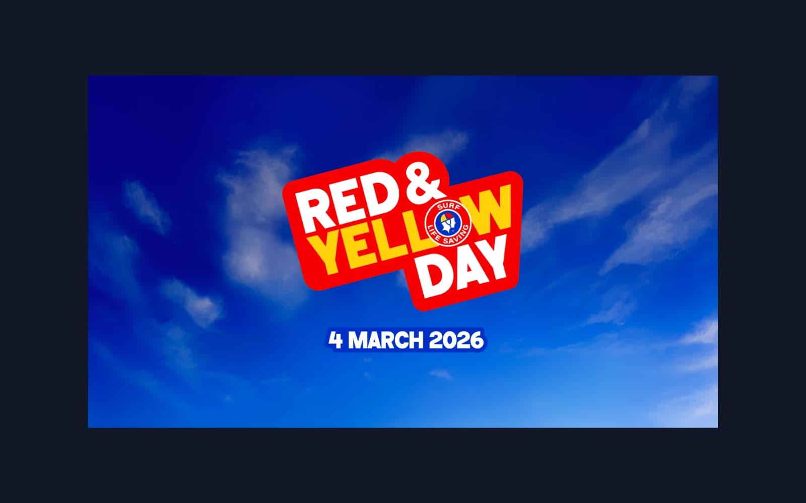
Content Marketing
Launching a National Charity Recognition Day
We were selected to deliver an integrated campaign promoting a newly established national day of appreciation for Surf Life Saving Australia. The scope included the brand identity design, influencer engagement, PR, activations, advertising and collateral design.
 Five by Five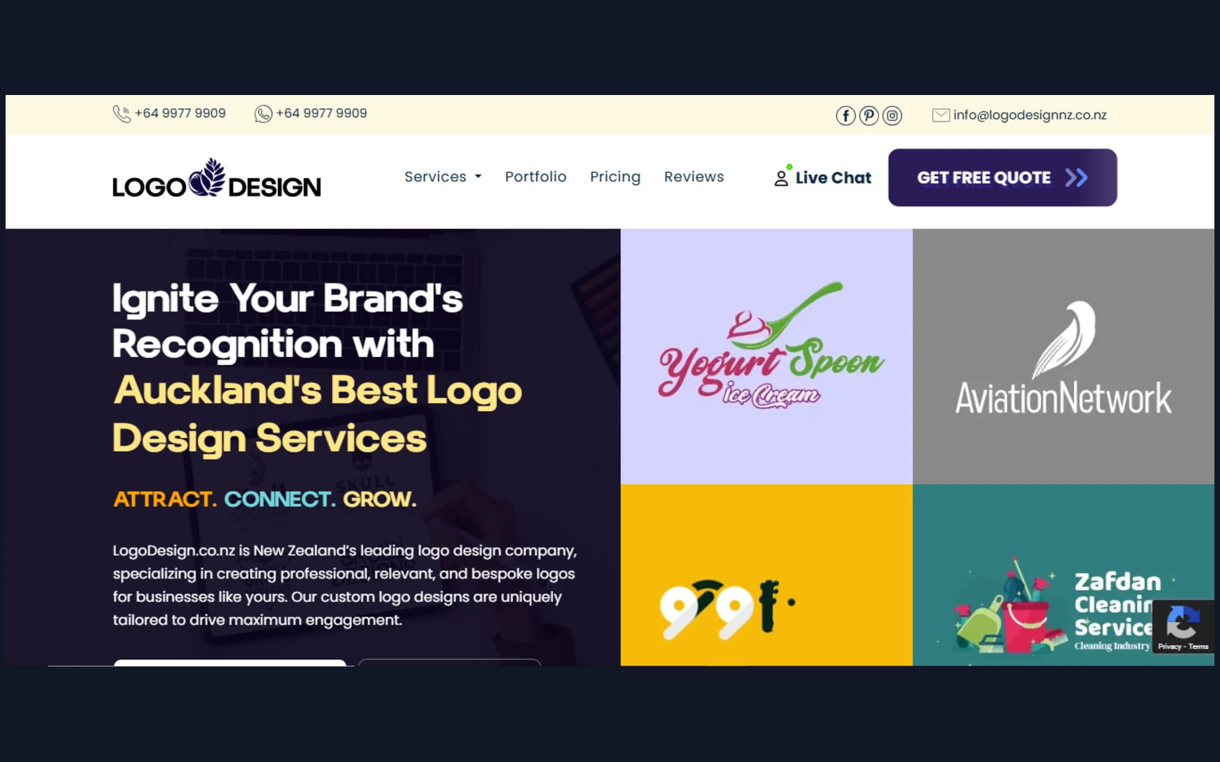
Advertising
Logo Design NZ
[Logo Design NZ](https://www.logodesignnz.co.nz/) offers imaginative and expert design solutions. The team provides specialized solutions that capture each brand's distinct personality, ranging from graphic design, website design, stationery, packaging, and promotional items to bespoke logo creation and branding. With skilled designers, adaptable packages, quick turnaround, and revisions, Logo Design NZ assists both new and existing companies in creating memorable visual identities that resonate with their target markets.
 Logo Design NZ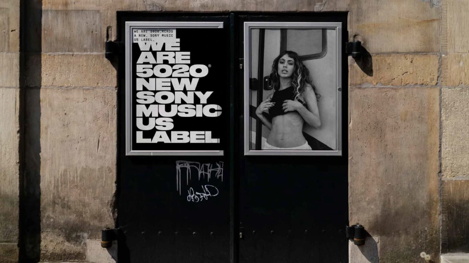
Branding
5020 Records
5020 Records is a Sony Music Latin label created to connect artists, audiences and culture across the Latin music ecosystem. The challenge was to build a visual identity that could feel contemporary, flexible and culturally relevant, while still working inside the structure of a major global music company. Que Cálido Studio® worked on the brand identity and visual system for 5020 Records, creating a language that could support the label’s artists, releases, communications and cultural presence. The project needed to feel connected to music, but not rely on obvious industry clichés. It had to be bold, adaptable and expressive enough to live across digital platforms, social media, motion graphics, presentations, merchandise and artist-related content. The work included visual identity, graphic system, typography, art direction and brand applications. The identity was designed as a flexible system rather than a static logo, allowing the label to move between different genres, artists and moments without losing consistency. A key part of the challenge was finding a balance between structure and energy. As a label, 5020 Records needed to feel professional and scalable, but also alive, emotional and connected to the cultural force of contemporary Latin music. The visual system was created to give the brand a strong point of view while leaving enough room for each artist and release to have its own expression.
 Que Cálido Studio®Verified