Challenge
Beyond the name, the brand's structure was also fractured, with each product line having a separate identity, creating unnecessary work.
Attic Salt stepped in to bring focus and clarity. Through our proprietary Brand Seasoning® Strategy Framework, we surfaced a crucial insight: the competition was louder, but they lacked substance. Loud Spectrum had an opportunity to go beyond functionality and offer something deeper: a story that moves people, not just product. This led to a structural shift to a branded house architecture, streamlining operations, clarifying customer understanding, and strengthening brand equity.
Solution
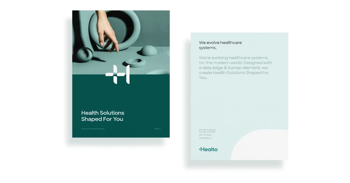
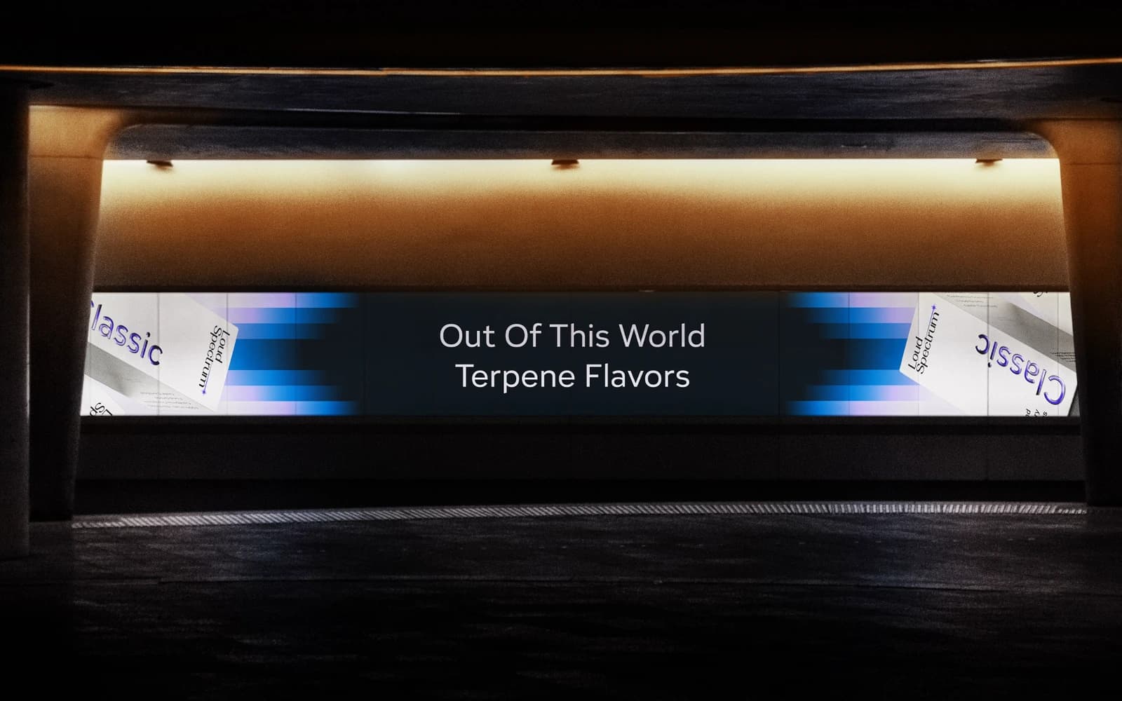
Inspired by quasars—the brightest, most energetic objects in the universe— the Loud Spectrum logo system embodies scale, intensity, and discovery, symbolizing molecular innovation with an expanding yet precise form that nods to their scientific expertise.
Paired with a sleek, contemporary sans-serif wordmark, the logo balances cosmic energy with modern precision, reflecting a future-forward ethos. Built as a responsive system, it adapts across formats—from micro labels to billboards—ensuring brand integrity and consistency across all touchpoints. This symbol declares their excellence and ambition to reclaim market leadership.
Anchored in the "Beyond Ordinary" creative direction, the visual language used intergalactic themes as a metaphor for Loud Spectrum's ambition and flavor intensity. A cosmic gradient palette distinguishes product lines while maintaining brand unity. Adelphi, a sharp yet clean typeface, mirrors the quasar logo geometry. The grid-system design ensures consistency and streamlines content creation across packaging, digital platforms, and beyond.
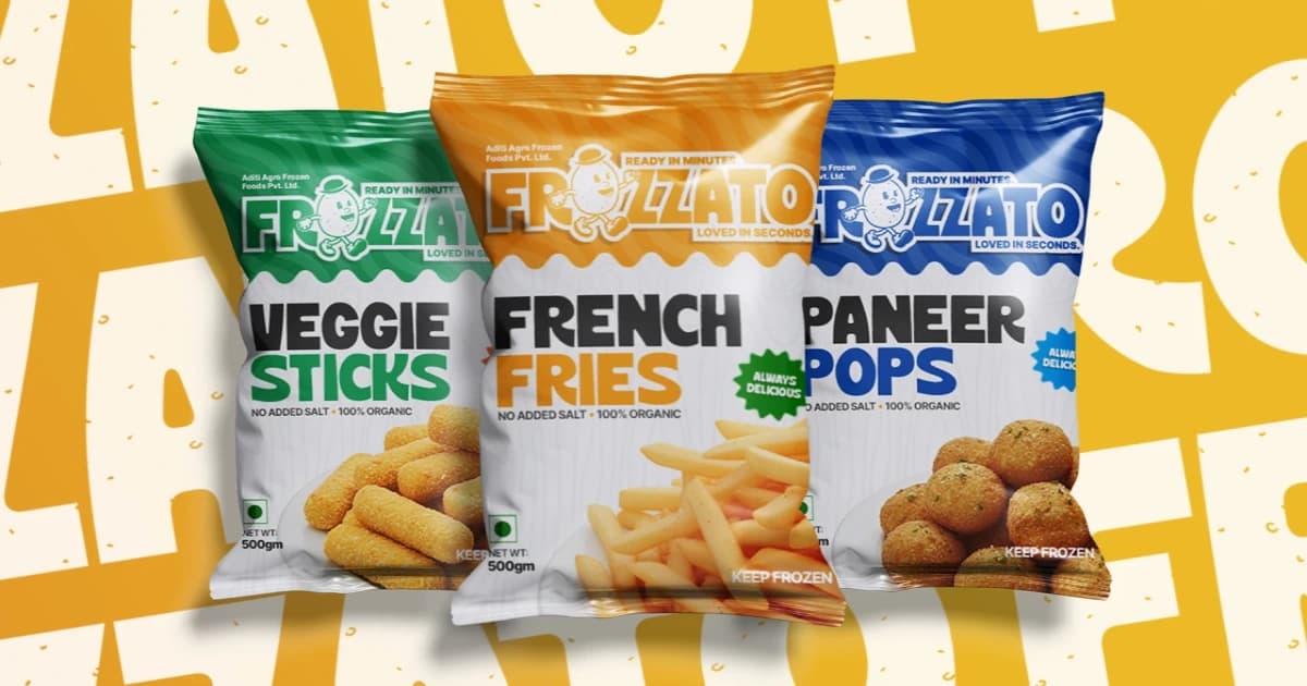
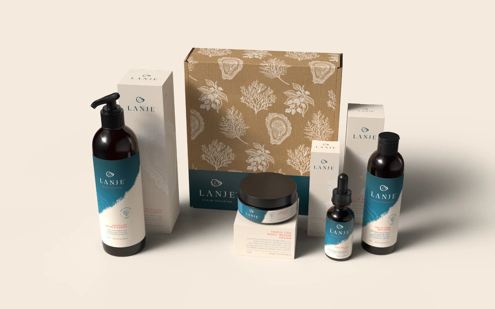
The product line was vast—over 200 SKUs across multiple sizes, flavors, and formulas. The previous packaging system struggled to scale, and inconsistent design execution was undermining product perception.
We continued the visual identity system across all labels, boxes, and bottles. Each product line received its own color scheme for instant recognition and unified branding. To overcome the lack of photography, we partnered with Mindful Motion for ultra-realistic package renderings, providing assets for e-commerce, sales, and social media. This brought harmony to their product line, streamlined production, and finally aligned their packaging with their product quality.
Results
The product line was vast—over 200 SKUs across multiple sizes, flavors, and formulas. The previous packaging system struggled to scale, and inconsistent design execution was undermining product perception.
We continued the visual identity system across all labels, boxes, and bottles. Each product line received its own color scheme for instant recognition and unified branding. To overcome the lack of photography, we partnered with Mindful Motion for ultra-realistic package renderings, providing assets for e-commerce, sales, and social media. This brought harmony to their product line, streamlined production, and finally aligned their packaging with their product quality.
 Rooland5.0(10)