
Paid Media & PPC
From Zero to Lease-Up: A Digital Strategy for Eastampton Place Apartments
422 Qualified Leads
 Social Fire MediaVerified
Discover & hire a top-rated agency to deliver results on your next task or project
422 Qualified Leads
Social Fire MediaVerified
Integrated Communications Campaign for Healthcare Corporate Venture Program. Healthworx, the innovation arm of CareFirst BlueCross BlueShield, approached us to do a full rebrand for its accelerator...
 HeadStart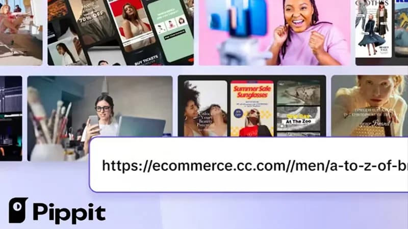
At Catchword, we were tasked by our long-time client ByteDance to rename their subscription-based video marketing platform, originally known as CapCut Commerce Pro. The existing name was not only a mouthful but also created brand confusion with their flagship editing app. We developed the name Pippit, a play on the pipit bird, which maintains the playful plosive energy of the original brand while introducing a breezy, uplifting personality. This new identity—complemented by the tagline "Create with wings"—transformed the tool into a distinct, verb-friendly brand that resonates specifically with the fast-paced needs of e-commerce creators and innovative e-tailers.
 CatchwordVerified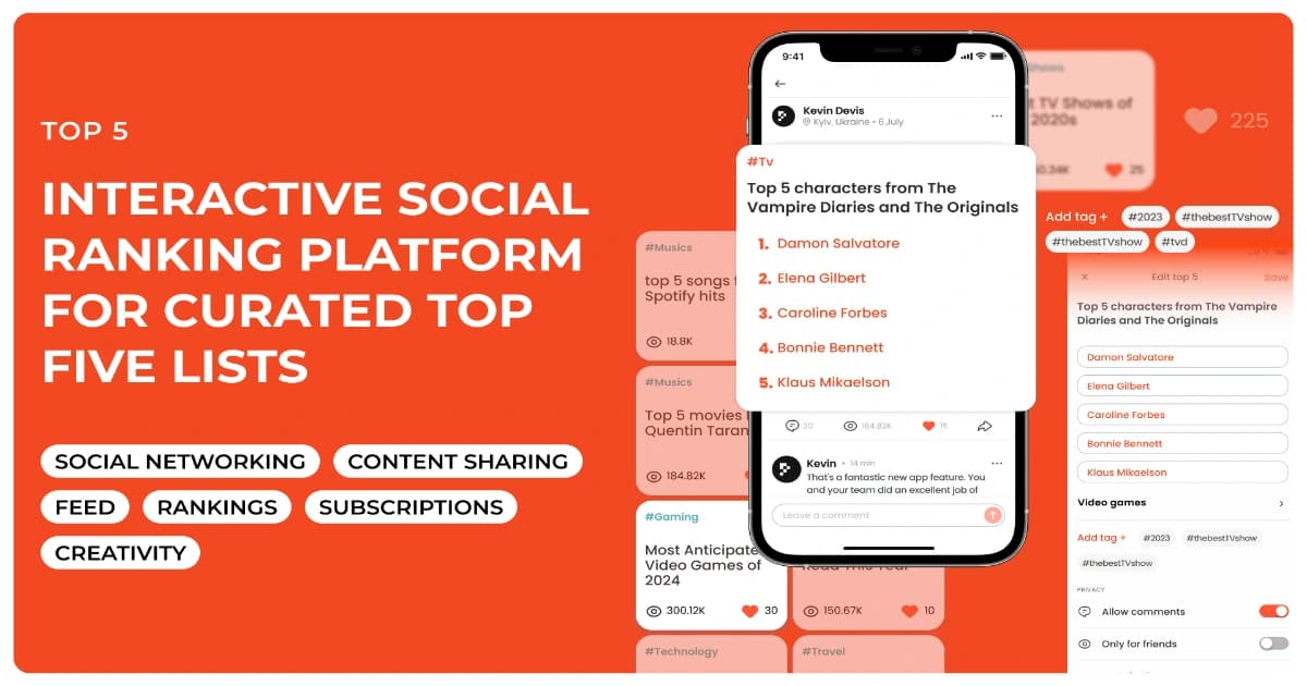
Top 5 is a social platform that allows users to create and share lists of their top five favorites — including movies, songs, restaurants, books, and more. The concept is built around personal expression and discovery. Users can interact with others' lists, get inspired, and explore trending topics. The platform emphasizes light, enjoyable content that fosters discussion and entertainment.
 WeelorumVerified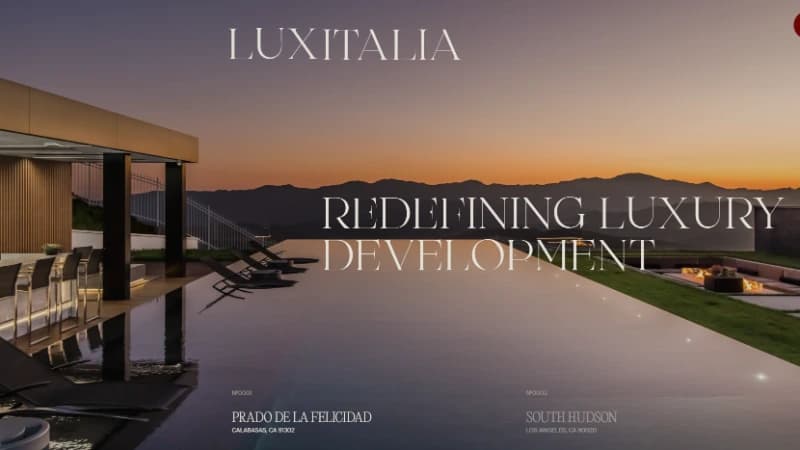
OSMOS partnered with Luxitalia, a luxury wholesaler of curated furnishings imported from Italy and Europe, to build their brand identity, website, and growth strategy. The goal was to create a digital presence that spoke directly to both high-end home buyers and designers, architects, and developers. We delivered a brand and web experience that helped Luxitalia become a staple in the luxury furnishings market.
 OSMOSVerified
Robyn & Robyn supported Conectrix with a strategic brand refresh designed to clarify the company’s visual direction, strengthen its professional presence, and create a more cohesive identity system for a technology-driven audience. The work focused on refining brand perception, improving visual consistency, and giving the company a more polished foundation for client-facing communications.
 Robyn & Robyn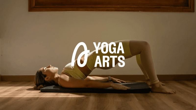
Designed a calming and empowering visual identity for Yoga Arts, a yoga space centered on recovery, focus, and growth. The brand targets people looking for more than flexibility — those after clarity, physical recovery, and performance through yoga. While primarily aimed at women, the visual language was designed to feel inclusive and welcoming to all. The palette combines earthy neutrals and oceanic blues to create a soft yet strong aesthetic — grounded, modern, and approachable. Typography uses clean, rounded sans serif fonts that echo breath, rhythm, and ease of movement. Imagery features real people in movement, highlighting strength, flexibility, mindfulness, and community. The tone throughout is clear, elevated, and restorative.
 Posta StudioVerified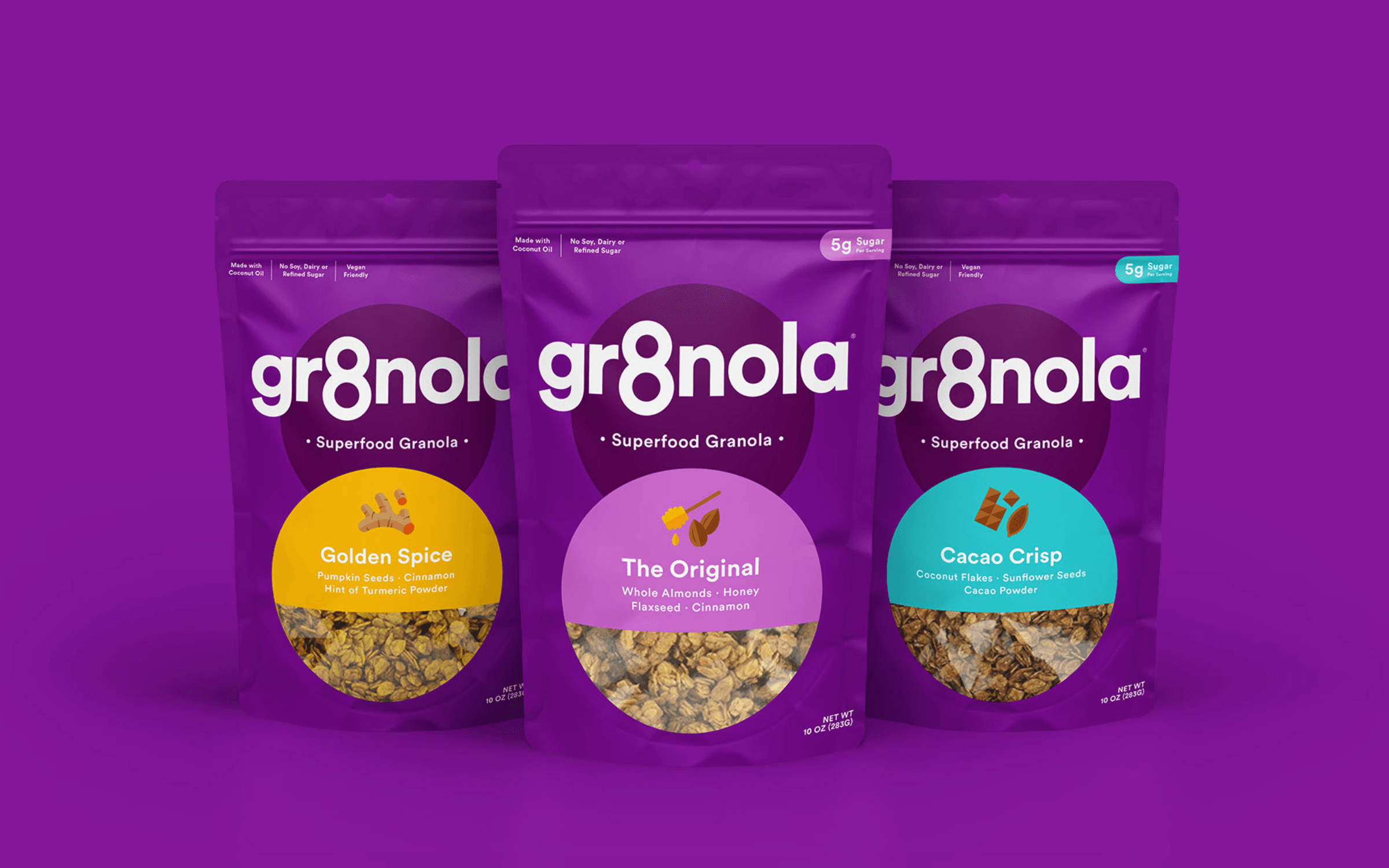
Deuce Studio refreshed the branding and packaging for Gr8nola, helping elevate the premium granola brand with a stronger visual identity that reflected the quality of its products while supporting continued business growth.
 Deuce StudioVerified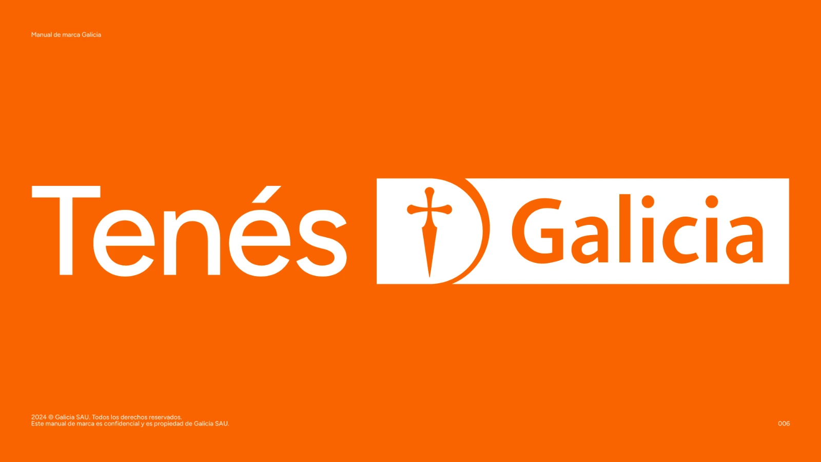
Banco Galicia is one of Argentina’s largest and most important private banks, with a massive national presence and a deep role in the country’s financial life. The challenge was to help evolve its brand identity without losing the trust, recognition and emotional familiarity it had built over decades. Que Cálido Studio® worked on a full rebranding process focused on making the brand clearer, warmer, more contemporary and easier to use across every touchpoint. In a category often associated with complexity, distance and anxiety, the objective was to create a brand system that could feel simpler, more human and more accessible. The project included brand strategy, visual identity, design system development, tone and communication guidelines, and a complete brandbook of more than 150 pages. The work involved aligning strategic thinking with a scalable visual system capable of living across digital products, branches, internal communications, campaigns, social media, presentations and everyday banking interactions. A key part of the process was understanding the emotional tension people have with money and financial institutions. From that insight, the brand needed to express clarity, confidence and ease, while still feeling solid enough for one of the country’s leading banks. The internal strategic idea “Galicia es fácil” helped guide the work: a bank that makes things easier to understand, easier to access and easier to trust.
 Que Cálido Studio®Verified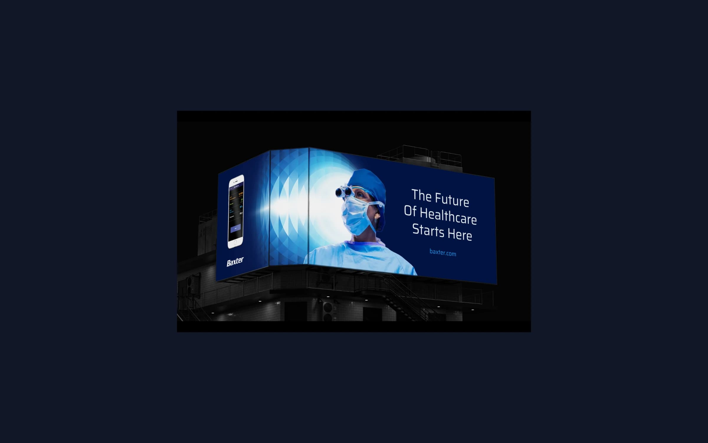
Following the divestiture of its Kidney Care business, Baxter International needed to reintroduce itself to customers, investors, and other stakeholders, with a visual identity built to work as well in today's digital spaces as it does in print. Starfish partnered directly with Baxter's internal creative team on a three-phase brand refresh, from narrative and roadmap through a new visual identity system and its rollout across the business.
 StarfishVerified
142 Units Fully Leased in just 9 Months
Social Fire MediaVerified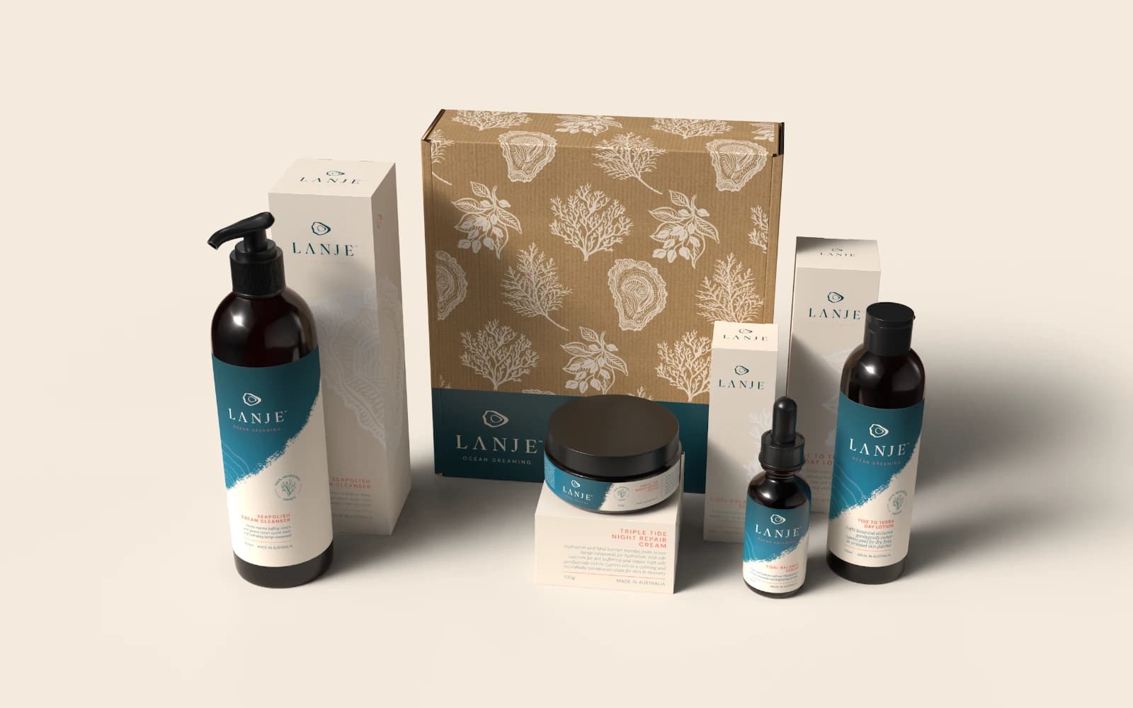
Challenge Lanje approached us with a unique vision: to create a skincare brand that respectfully unites ancient Aboriginal knowledge with advanced marine science. The challenge was to forge a distinctive brand identity that would stand out on a crowded shelf while authentically telling a story of Land and Sea, tradition and innovation. Solution We developed a comprehensive brand strategy and visual identity that brought this powerful duality to life. Our solution included: A Unified Identity: Crafting a complete brand identity, including logo design, typography, and a bespoke colour palette. We merged the deep blues of the ocean with the rich, terra earth tones of Broome to create a visually arresting look. Bespoke Illustrations & Packaging: We designed custom illustrations and a full suite of packaging that feels cohesive as a collection and compelling for each individual product. The design narrative seamlessly brings together the 'Tide to Terra' concept, honouring the brand's roots. Strategic Brand Framework: We built a strategy ensuring the brand's essence—a fusion of Bardi Jawi heritage and PhycoHealth’s seaweed science—was communicated with elegance and clarity at every touchpoint.
 RoolandVerified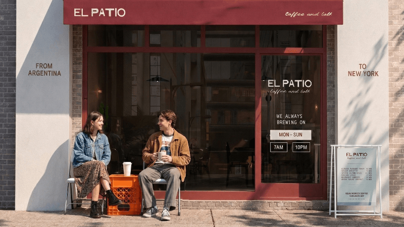
Brand identity for EL PATIO, a New York coffee brand that reinterprets Argentine café culture through attitude and gesture rather than obvious symbolism. The project focused on translating tradition — not replicating it. Instead of decoration, we focused on behavior; instead of symbols, on gesture. The primary icon draws from a plastic produce crate turned upside down into a table — functional, unpretentious, intentional. The visual system pairs clean typography (Royale Couture + Andale Mono) with a warm, grounded palette of deep burgundy, muted teal, and confident coral. The identity extends across storefronts, packaging, merchandise, and printed materials, positioning EL PATIO as a cultural intersection between Argentina and New York.
Posta StudioVerified
Calm is an Argentine mattress and sleep brand created to challenge a category that had traditionally felt technical, cold and hard to understand. In a market where most brands spoke about materials, discounts and specifications, the opportunity was to build something more human: a brand about rest, comfort, trust and the emotional value of sleeping well. Que Cálido Studio® worked on the brand strategy and visual identity for Calm, helping define a clearer and more distinctive position in the sleep category. The challenge was not only to design a mattress brand, but to create a system that could feel simple, approachable and memorable across digital commerce, packaging, communication, campaigns and everyday brand interactions. The project included brand strategy, positioning, visual identity, tone of voice, graphic system and brand applications. The work moved the brand away from the usual language of mattress companies and toward a warmer, more direct and more emotionally relevant expression.
Que Cálido Studio®Verified
+600 employees reached internally
 Digital Brew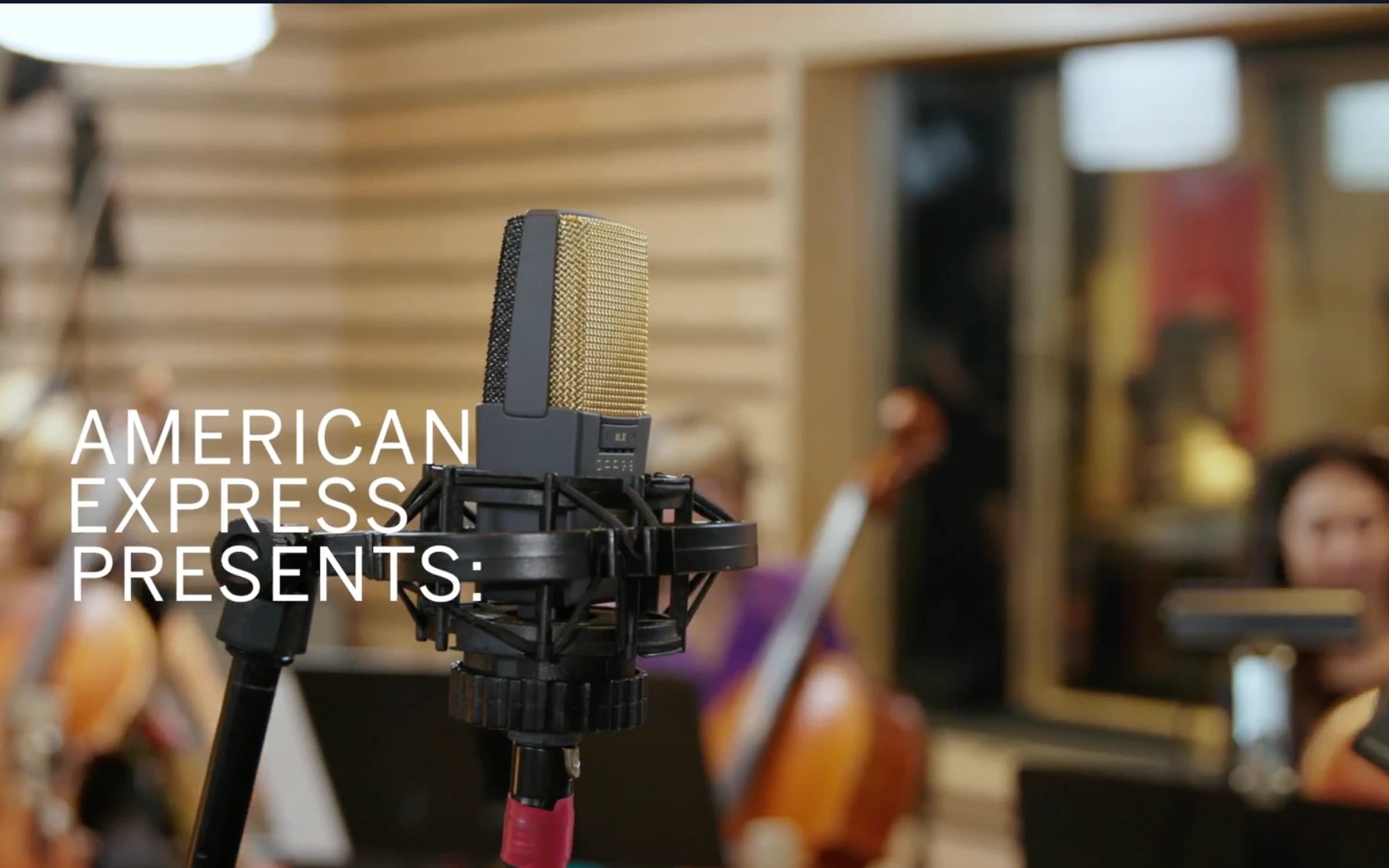
American Express partnered with sonic branding agency Man Made Music to develop a global audio identity designed to complement its iconic visual brand. Colormatics was brought in to document the process, capturing how the sonic brand was created and why it matters for modern brand experience across every customer touchpoint.
 ColormaticsVerified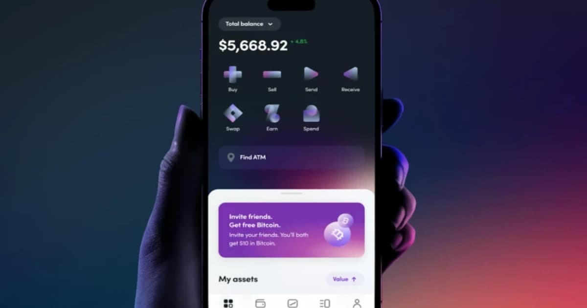
We partnered with Olliv to build a modern financial planning brand from the ground up — spanning identity, digital product, and web presence. The goal was to make financial guidance feel approachable and trustworthy in a category known for complexity and jargon.
 ANML
ANML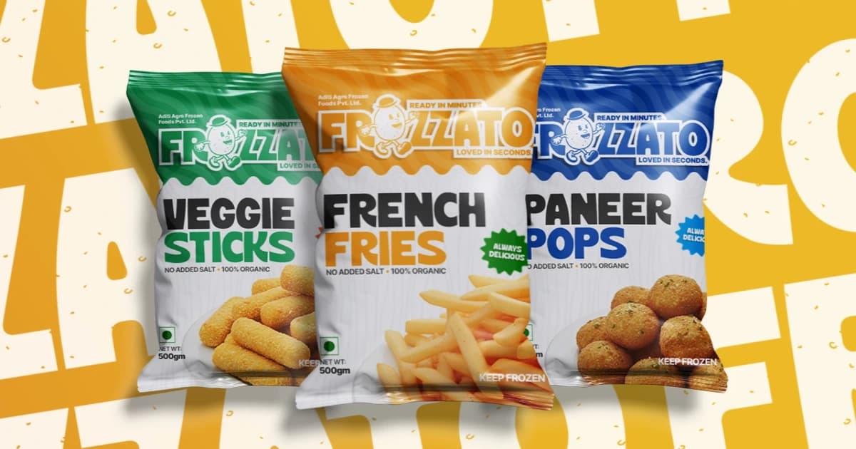
Frozzato is a frozen food brand built around delivering restaurant-style snacks at home. We developed the complete brand identity, including strategy, visual identity, packaging system, and brand guidelines.
 Jordie's Creative AgencyVerified